Tag Archives: series

The very latest cover series mockup

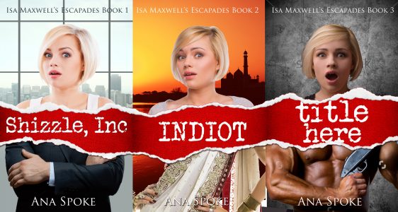
Thank you so much for all your comments! I have obsessed some more over the photos and composition, downloading mo less than forty fonts and a few dozen cityscapes and curvy women in beautiful dresses. I pushed and tugged the rip this way and that, and I am now excrutiatingly close to being done with it. As per usual, I’m not so sure about the fonts, although I think the title font is now the best I’ve managed to find in three days of going nuts with 1001(literally!)freefonts.com. The author/series name on the first one is exactly the same as title, only not in capitals. The third one has much planer author/series fonts.

As per usual, I’m not so sure about the fonts, although I think the title font is now the best I’ve managed to find in three days of going nuts with 1001(literally!)freefonts.com. The author/series name on the first one is exactly the same as title, only not in capitals. The third one has much planer author/series fonts.

What do you think? And thank you in advance 🙂

All three books together 29 May

40 Comments

Filed under Self-publishing and marketing

Please help me redesign the covers for Isa Maxwell series – including the third book!

First of all, sorry for the Rafflecopter giveaway starting later than I expected – forgot that it’s in the US. If you’d like to go into a draw to win a $20 Amazon gift card, please enter here.

Now, about the cover design – I’d like to thank everybody who’s helped me along the evolution of Shizzle, Inc Inc cover. I just had a look at the first mock-ups and some developmental milestones along the way, and I can’t believe how much the cover has changed. I did not have a clue at what I was doing, and thanks to you, I keep getting comments on Twitter that people have bought Shizzle, Inc based on just the cover alone.

I love that cover, and the one for Indiot, but the problem is, they don’t look like they belong in a series:

FINAL COVER September 5  FINAL Indiot Kindle cover revised necklace

That’s a problem because my marketing strategy is now relying on pushing the free first book in the series, in hopes that people get hooked and buy the second, and the third when I get to write it.

So this is what I’m thinking of doing instead, and by the way – meet the mock up for the third book in the series! I’ve decided to do a mock up of all three books at once, to see immediately how they will look next to each other. The new idea is to take the rip effect seamlessly across the entire series. In each book, Isa is on top, at the same scale, and at the bottom is the antagonist threatening to ruin her life.

What do you think about these versions? Version A has different title fonts and backgrounds, and version B has the same fonts and background across all three covers.

VERSION A:

All three books together

VERSION B:

All three books together same font

In addition, I would appreciate the input on:

  1. Author name font and size
  2. Series name font and size.
  3. Font for Shizzle, Inc – I will update the rip, and want to update the font, too.

Thank you in advance for your help! To return the favor, I plan to stage another free cover design giveaway shortly, so please stay tuned!

74 Comments

Filed under Self-publishing and marketing