
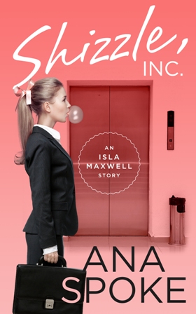
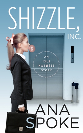
I finally got my draft cover from the designer! Maybe because the buildup to this day was so intense, I can’t help but be a little disappointed. I know it’s just the concept, and it looks professional, but at the first look neither one of the two versions grabbed me:
After a few hours of staring, however, it occurred to me that it’s not about whether I like it, it’s all about whether you do. Do you? Please let me know what you think. I’ve decided to wait a couple of days before I get back to the designer, but here are my thoughts so far:
What I DO like about this concept:
1. It looks like a “chicklit” cover, which is helpful for potential buyers.
2. It’s simple, with bold lettering.
3. Cute treatment of the “S” in my last name.
What I DON’T like:
1. It’s not funny or original and does not let the reader know that it’s a bizzare comedy.
2. It’s static and the girl has no emotion. None of the adorable innocence and bewildered ignorance of Isa.
3. The lift does not say “corporate offices of a billionaire”. It looks like she’s just going to work in any office.
4. The title and author name are competing in size.
This was my mockup, provided to the designer:
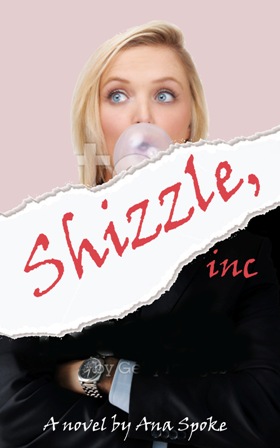
I wanted a juxtaposition of a bubbly girl and a cutthroat corporate world. The torn paper represents the chaos Isa brings to the empire of Shizzle, Inc. Once again, though, it’s my opinion. What do you think?


