Ok, I know you’re sick of this by now, but…Just. One. More. Time.
At least I’ve managed to pick one of the two concepts. I went with the more literal one, which also happens to use a face. The research shows that people respond to faces, and it also shows that I respond to research findings. So there you go, one decision made.
I’ve also spent hours searching Shutterstock for better images. Here are the previous version (on the left) and the new one (on the right):
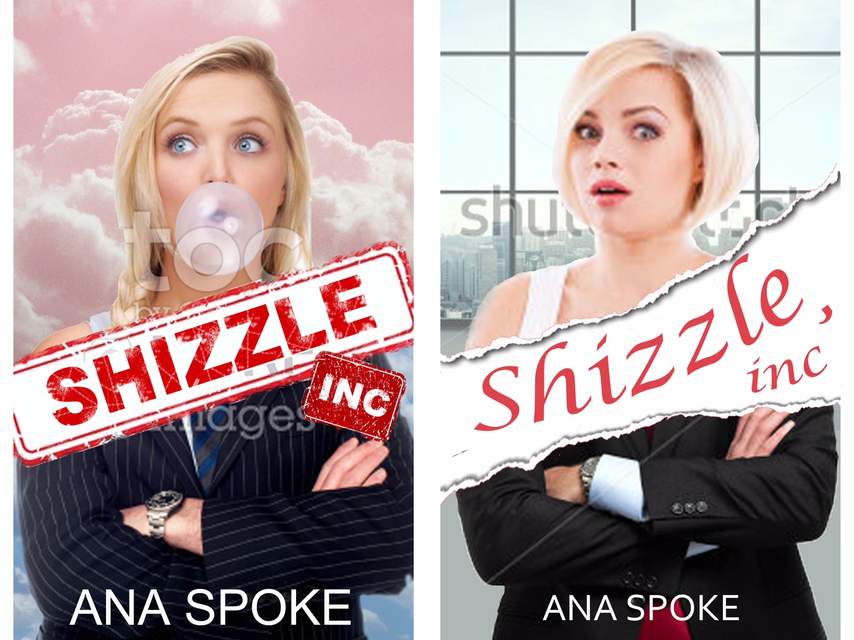
I’m practically in love with this new model. Not only her facial expression is spot-on, she’s also not stick-thin, like most of the pretty blond girls on Shuttersock. At one point, desperate, I was going to hire a model and a photographer, but I don’t think I could wish for a better girl.
I’m also happy with the background, which (when I pay and download a proper photo) shows a view of a downtown city. The colour is also fitting.
The man’s arms read better, but some people were confused and thought Isa just has “man hands”. May have to look more.
Not at all happy with lettering, but being an optimist, I’m sure a solution will come to me, maybe in a dream or in the middle of a meeting.
So there you go. One baby step closer to the finish. Brilliant ideas and suggestions would be much appreciated!


I think the newer cover has more appeal than the first. I like the girl on it better, and the background adds interest.
LikeLike
Thank you! I think it tells the story better, too.
LikeLiked by 1 person
Shutterstock is the best. They have supplied me with Yetis, Aliens, and Nerds.
LikeLike
Lucky you…I’ve tried to find a “blonde in a limo roof”. I see them just about every Saturday night, but not on Shutterstock.
LikeLiked by 1 person
Thank you so much for tweeting about it!
LikeLike
I like the background. The buildings make you think that your looking out of an office window onto a city. I also like the color of the background. I like that you show more of her shoulder. I like how the tear that Shizzle,Inc is sitting in is smaller and torn different. I like the Font of the Shizzle I wouldn’t make it much bolder than it would get to busy. Right now it plays well with everything else, it’s feminine like your main character. Now for the bottom of the juxtapose. At first on your covers I thought it was her in a suit because of the covers that you paid to get but when I saw a bigger picture of the left one with the bubble I noticed a hairy hand and wondered if you meant it to be her boss. I think it is confusing to potential readers as they haven’t read your book yet and don’t understand their relationship like you do. On this new one you have it perfectly lined up with her shoulders so it looks feminine not masculine and the left hand looks feminine and the right masculine. I think if you want to do the juxtapose top to bottom use the bottom suit from your first try it is mostly dark, doesn’t show any hands or real body width and the part of the hand that shows looks very masculine to me.I think it would go well with the top part of your newest cover.I still think you should highlight a letter in each of your names maybe the n in Ana and the o in Spoke in red or pink. I know you really like the newest model and I like her looks but her expression is kinda weird. It’s like she is caught in mid sentence or disgusted or surprised. To me it was hard to figure out so I asked a couple of friends what they thought since your marketing it in the States ( it’s where we live) and one thought maybe she was mad and the other thought she was frozen in the middle of saying something. I thought you might like the input. I don’t know if that’s what you were going for with that expression. Maybe to get the Juxtapose you might to want have him standing off to the side with his back to us and have her leaning around him with that expression on her face with the new background. That would clarify he’s an authority figure and she’s a young trouble maker working for him because of the clothing,body positioning, the expression and the new background. Now I have to ask a question only because my friends asked me and well I didn’t know the answer. My friends asked if you knew what the word shizzle was slang for since you live in Australia. I’m sure you do but I’ll just tell you in case you might not… it’s slang for sh*t. My one friend cracked up laughing because you named your book Sh*t,Inc. I can’t wait to read your book neither can my friends. If you didn’t happen to know this you can go to slang.org to check. Had another idea for you to advertise it would only help you down under but hey your gonna sell your book there to, right? Here people get large magnetic signs made to put on their car doors to advertise whatever it is that they want to and when they don’t want it on there they just pop it right off. I would think you have that down under. If not I could hook you up with a company in the States. You worked hard on this one. These are only my thoughts ( my friends liked the side by side juxtapose,too). Remember once someone reads a book they get the cover. Keep us posted! Oh, I like the name Bubbles, it fits her picture!
LikeLike
Thanks again Olivia! Can’t believe you had a focus group!! Much appreciated 🙂 I’m actually about to get a local designer to help me get the last bit of polish on…
In terms of slang, I’m aware that it could be “sh*t”, as in “it’s the shizznit”. It’s aslo “for sure”, as in “fo shizzle”. The name is risky, but it fits the idiot billionaire who owns the company. It’s hard to explain, but hopefully, once you “meet” Mr. Hue, you will understand why he’d call his company “The Sh*t, Incorporated”…
LikeLiked by 1 person
Mr. Hue sounds like Donald Trump, LOL. I dated an Aussie so I figured you knew but my friends weren’t sure so I was “asking for a friend”. I’ll tell them I was right. I don’t think the name is risky, just catchy and funny. We were working on a business project and talking about books and I thought about yours so I asked if they would like to take a look and were impressed with your talent. I have two more ideas and then I’ll shut up. If you did the vertical side by side put him on the right with his back to her or his back towards the reader and her on the left facing the reader then put the torn Shizzle in between them to represent the chaos she brings to the firm and use the window back ground. This way your defining their relationship on the cover and letting readers know there is a male presence in the work place and there is something going on that tears the situation up with the title between them. Next is have him sitting in the background at a desk with his back to the reader, talking on the phone which would define him in the position of authority while she is in the forefront. Put the title at the top or bottom depending on how you want to treat it. Just some thoughts. Good luck with the designer! Hope the last bit of polish makes it sparkle like you want!
LikeLike
Hi Ana. I think the second cover looks a lot better- it has a more professional look.I like the torn photo look and the two images look like they are put together seamlessly. I have no idea what you story is about but the book cover makes me think it is something about workplace politics. Maybe the title font could be a hand written scrawl (not comic sans haha) on a post-it note? I didn’t read the whole comment above, but having a cursive glance (pun intended), I noticed the comment about the slang. I’m in Australia, and I thought you were referring to the slang use too…
LikeLike
I agree with Olivia – I didn’t catch the ‘juxtaposition’ of female/male… I also thought the bottom part was still her, just dressed in a suit. So yes, move to side by side, or else just move the bottom ‘male’ part slightly off, to right or left. Don’t know how that would look, though.
Now I’m curious to read the thing! 😀
LikeLike
I don’t like the curve of the title; other than that, it looks pretty good! I didn’t notice the ‘man hands.’
LikeLike
Thank you April. The title will be completely reworked, at the moment I like noting about it…
LikeLiked by 1 person
I like how you write. You’re funny.
LikeLiked by 1 person
Thank you 🙂 Just you wait till my novel comes out…there are literally hundreds of pages worth of this nonsense.
LikeLiked by 1 person
HA! Sounds good.
LikeLiked by 1 person
OK! I love the cover! The look on the girl’s face is, “You said what, now?” I like the tear out look with the title, and as an “uptight” Southerner in the US, I love the title! Actually, I’m not at all uptight, but you can’t please those people. I’m an English teacher, and my primary site is not spontaneous whimsy. I’m just starting that one to have an outlet to write about non-teacherly things. Thanks for stopping by!
LikeLiked by 1 person
Awesome, thank you Socrates 🙂 great to hear, as the novel is set in Southeast and Shizzle, Inc belongs to the seventh richest man in the Southeastern US…
LikeLike
I prefer the lettering from the first cover, but the second design is much better – it looks a lot cleaner and stands out a lot more.
LikeLiked by 1 person
Thank you so much for your comments! I agree, the second one is better in every way, except lettering. I have another idea I’m going to try this weekend, while waiting for the proof-reader to finish, hopefully the cleanest and boldest of all 🙂
LikeLike
Looking forward to seeing that one too:)
LikeLiked by 1 person
The second cover sold me the book. I can’t wait to be able to order it!
LikeLike
Omg, you’ve made my day 🙂
LikeLike
Pingback: Another (designer) bites the dust… | AnaSpoke.com
Pingback: Please help me redesign the covers for Isa Maxwell series – including the third book! | Ana Spoke, author