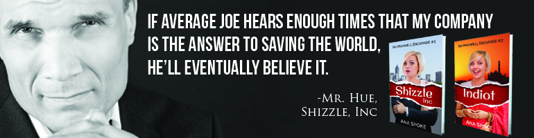
Otherwise there will be a hundred cover versions! Good news is that I will have the final draft from the proofreader in just a few days, so the torture is almost over. For now, please join me in nitpicking on these:
I have decided to move away from the double-rip, the last version of which looked like this:
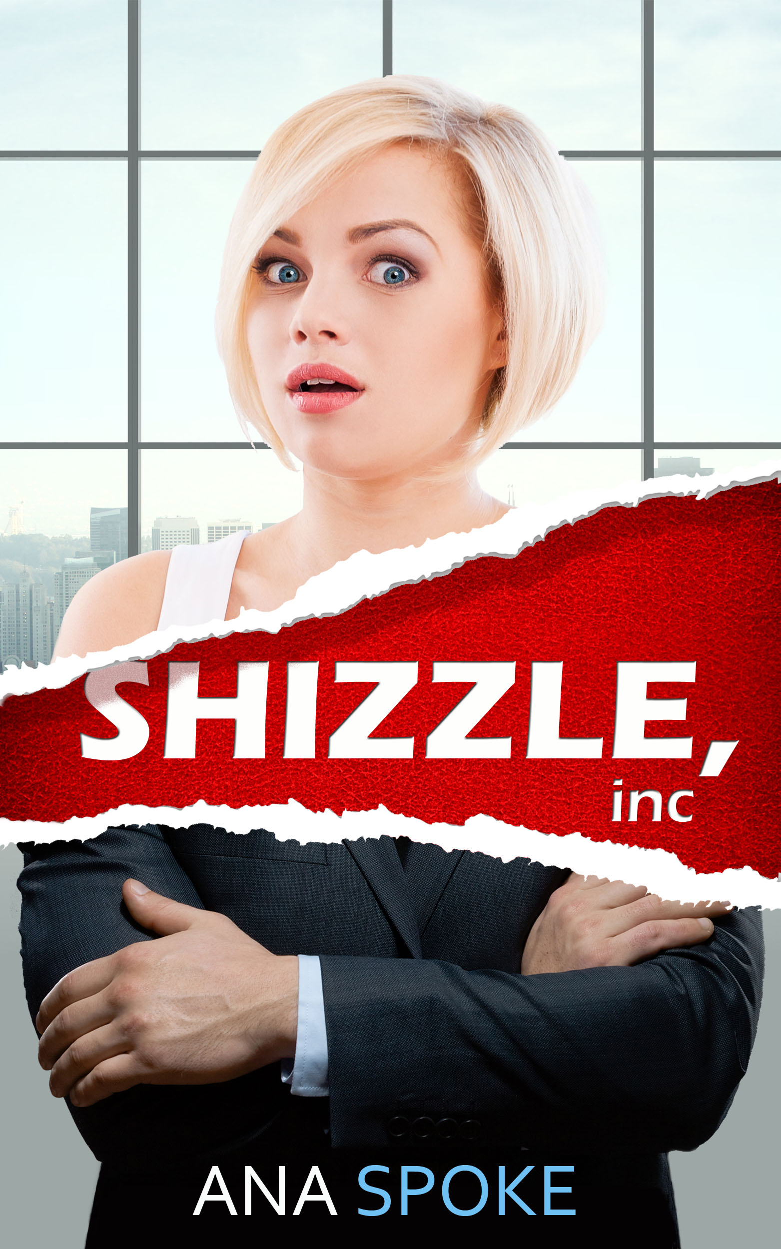
Once again, I’d love your comments. If you’ve had enough, I completely understand and promise that this one will be the very last post about cover design. Ever. Probably.


I prefer either the 3rd one or the 4th one ☺️💖
LikeLiked by 1 person
Thank you! Is it something in particular, like the title placement?
LikeLike
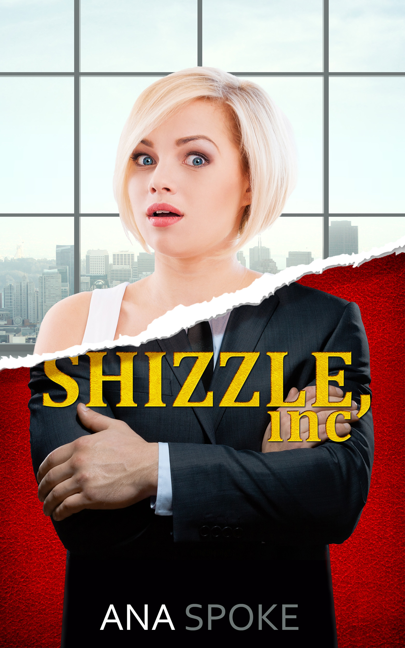
The fourth one I like ’cause yeah the title placement – I just think the suit bit sort of drowns out the top bit (which I’m assuming is a key point in the plot?). The third one I like ’cause the placement of your name so everything seems more balanced ☺️
LikeLiked by 1 person
Thanks again! I might play more with where I place the rip, too.
LikeLike
Glad I could help! 💖
LikeLiked by 1 person
I mean, move the rip down a bit, so that the suit is not overpowering.
LikeLike
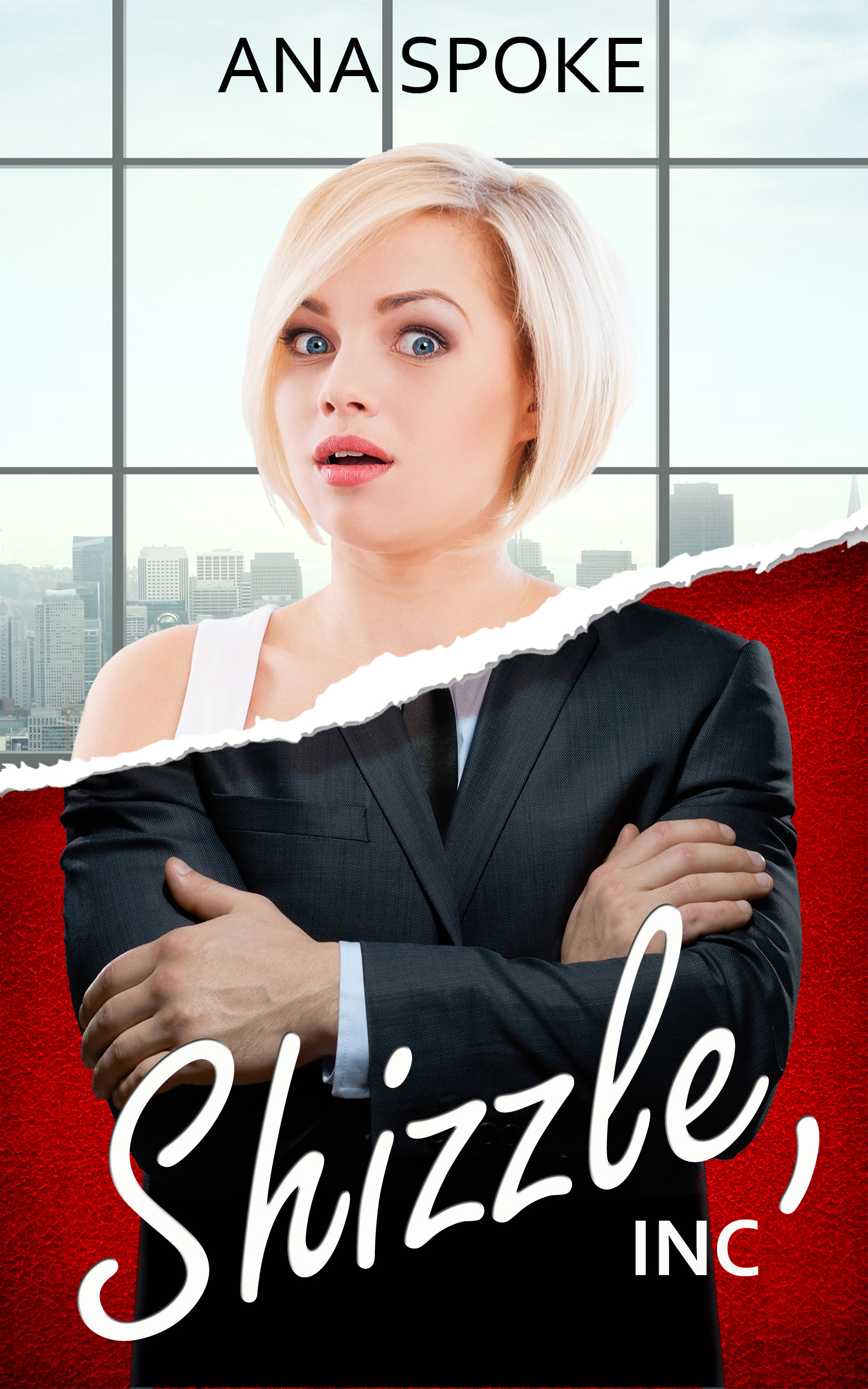
I like the first one best.
LikeLiked by 2 people
Thank you! Is it the script type vs the print type?
LikeLike
Yes. To me it’s more eye appealing then the others.
LikeLiked by 1 person
Thank you. The script has been the hardest. I am not allowed to download internet fonts, so its Photoshop-standards only.
LikeLike
I think you were right to do away with the double rip. I was torn between the first and third version of the cover. I like the font of the title in the first one and the symmetry between your name and the title but the use of yellow in the title of the third one kind of drew me to it.
LikeLiked by 1 person
Thank you! Whew, at least that was a step in the right direction 🙂 It’s an amazing learning process, to design it yourself, I can’t imagine a designer fussing so much over the bits (at least not the one I originally got).
LikeLike
I think it’s quite an achievement that you’re doing it yourself. At least that way you haven’t got the hassle of telling a designer possibly over and over that it isn’t quite right, you can just work on it yourself until you’re finally happy with it.
LikeLiked by 1 person
Thank you 🙂 I did have a designer to begin with, and that’s exactly what happened – he was really good technically, but didn’t “get” the novel. This way I can indulge in fretting over every detail without the worry of hurting designer’s feelings.
LikeLike
You’re welcome. Sometimes, you just gotta take things into your own hands. 😊
LikeLiked by 1 person
I kind of like the first one best. I like the font for the title, it just pops out more to me.
LikeLiked by 1 person
Thank you so much!
LikeLike
I like The first one best. I loved The placement and The script type!
LikeLiked by 1 person
Thank you Sandra!
LikeLike
Strange you’re moving away from the double rip because I quite like that one Ana. I’ve just published now for the first time so feeling euphoric so please excuse me if I come over all enthusiastic. Personally, I think the type face on version 1 is by far the best, whichever design you choose afterwards. The script looks excellent and marks it out from the norm. All the best anyway…
LikeLiked by 1 person
Thank you Nick! I was trying to limit the number of elements. So far my survey leans to one rip…appreciate your interest, and congratulations on publishing!
LikeLike
I love the 4th one! However, the first and third look amazing as well. I know you can’t judge a book by its cover, but your cover looks pretty amazing.
LikeLiked by 1 person
Thank you so much! It has been a process filled with frustration, but an awesome learning experience 🙂
LikeLike
#4 looks the best.
LikeLiked by 1 person
Thank you! So you prefer the double rip too…
LikeLiked by 1 person
The Font in number one goes with the title though
LikeLiked by 1 person
I liked the double rip… but out of the three I think the first one! 🙂 😀
LikeLiked by 1 person
Thank you! Hmmm, unexpectedly a few people are liking the double rip better…
LikeLiked by 1 person
It is more appealing actually… you should think about keeping it! 🙂
LikeLiked by 1 person
The new plan is that I will print all of them and hang them on the wall for a week, taking down one least favourite per day. Thank you for your input!
LikeLiked by 2 people
That’s a good plan. All the best! 😀 ❤
LikeLiked by 1 person
I like the second one for the clear placement of the text. I don’t know if it is intentional, but in all of them the bodies of male and female are misaligned, i.e., the collar of the male should align with the neck of the girl/lady.
LikeLiked by 1 person
Thank you Sunil, you’re right, out of alignment! My sister picked it after I posted…will fix in the next edition. Mans shoulders are wider, so I will need to play with the placement of the rip.
LikeLike
I love the last one the best!
LikeLiked by 1 person
Thank you! Is that because of the double rip?
LikeLike
Yes!
LikeLike
I think the single tear is working much better for your cover. I’ve looked long and hard at all of the covers and come to a decision on the one I like out of the four. It is the second one with the special effect treatment on the bottom. I believe it shows a reader that a male presence is involved with Shizzle,Inc. in the book because you can see both arms and hands and the whole suit. The font and color gives the impression that Shizzle,Inc. belongs to a rich man, it screams billionaire. You hit the nail on the head with that as the ol’ saying goes. I like the Small “Inc” in Shizzle ,Inc. better than the larger font Inc. You need Shizzle to be masculine if you put it on that part of the cover because it belongs to him. And what it stands for in slang is never said Oh,Shizzle in a sweet, soft tone of voice. When I use it usually comes out loud and strong and well… you get my drift. If it was on her part of the cover, than yes,a softer version like on the first cover. The only thing I would change and it isn’t anything big but having your name at the top over her head looks like you are saying this girl is Ana Spoke because of the placement .To make it look different just change your last name to a different color maybe in the red range. Another reason I picked this cover is everything is balanced not to busy at the top or the bottom, nothing pulling the eye in the wrong direction. I love that there is a difference between the top of the cover and the bottom by such a subtle effect. I think it helps define what the story will be about. Two people from two different worlds and the tear effect lets you know something is gonna be happening but what??? The only other way I would go with this same cover would be to move the Shizzle,Inc. up under the tear and your name down to the bottom in two different colors like on the other covers. The other three are good but I have a problem distinguishing that the top is female and the bottom is male on these three. Hey, one of my friends just stopped by and I asked her to take a look ( I didn’t tell which one I liked) and she picked the same one!!! I guess we have good taste. LOL Pick the second one just change the color of your last name and it’s the winner! Good luck. I wish you the best and can’t wait to see the final draft from the proof reader.
LikeLiked by 1 person
Thanks again Olivia! It makes sense that the font is masculine. Perhaps I need to get an even blockier one. The effect you liked is a gold leaf overlay, I’m quite find of it too, as it says “older” and “rich” and is very different from the bright and clear top. Almost there! Can’t wait to hear what you think of the actual book 🙂
LikeLike
First, the gold overlay doesn’t make his skin look like crocodile skin. It says this is a very wealthy businessman. It adds depth and texture, much better effect than the bright and clear top. It lets the reader know that this is a man on the bottom half of the cover. When you line up his shoulders exactly with hers it makes him look feminine and that is one reason people make the mistake that its her in a suit. It is OK for his body to be bigger because he is a totally different person than her. He is a man an therefore much wider in the shoulders. It would also define his position in the novel. I don’t care for the first one the Shizzle is too feminine for that bottom. On the third, the Sizzle,Inc is too large and covers up too much of the man, makes the middle busy. My next pick for the cover would be the double tear. Maybe add the gold overlay to the Shizzle,Inc. for the rich billionaire look. See if you can find that font you hinted looking for that screams classy, rich and older. Anyway just a few more thoughts to cram into an already overloaded brain. Hang them up and just glance at them every once in a while when you walk by without thinking and don’t just sit staring and the right idea will start forming for you. Good luck! Can’t wait to see what you come up with!!
LikeLiked by 1 person
Thanks again Olivia! Yes, I think a few days of quiet would be needed to make sense of it all 🙂
LikeLike
well if you don’t like the double rip… then I would say the first one… I just think a word like Shizzle should be written in a more fun sort of script… especially since it’s on the section that has the serious business suit… it sets an eye catching contrast… while the other lettering is honestly boring… and plus with it at an angle it just seems to go more with the flow of the rip as well… altogether everything just seems better set up on that one…
LikeLiked by 1 person
Thank you so much! I will have to process all the feedback, as a lot of it is opposite, which makes it harder, rather than easier 🙂 The idea is that by putting it out there I design what the audience likes, rather than myself, since I already love my novel to pieces 🙂 Very hopeful that by printing them all out and hanging them on a wall for a g=few days will help clarify things, cause I’ve been staring at them on screen for hours. Thanks again!
LikeLiked by 1 person
Thanks so much for following my blog. I saw the cover designs you have for your book and they all look pretty fabulous. Picking must be impossible. Good luck! Though I think I like the 3rd one best.
LikeLiked by 1 person
Thank you in kind, Jessalyn. Right now I have no idea which one to pick, too much input, but I will trust my subconscious to sort it out after a few sleeps.
LikeLike
Good idea. ^.^
LikeLiked by 1 person
The designs all look great! I don’t know that you can go wrong, regardless of which one you choose. ^_^ My preference is for the fourth one with the double rip, but perhaps use the font from the first cover for the title instead? That would balance the feminine and masculine aspects of the image a bit better than the block font does. I’ll be working on the cover for my second book very soon. The process is both fun and maddening! lol
LikeLiked by 1 person
Second book! Congratulations! This is definitely maddening 🙂 I will let it soak in and make a list of pros and cons and see how my subconscious processes it over the week… thank you for your input!
LikeLiked by 1 person
I like the first because of the font choice and because the hands look more like hers. Number 2 the hands look almost yellow in my screen. The S. In number 3 is cut off, so I don’t like that. If it was a tad bit lower and inc was more contrasted, it’d be my favorite. The red and double scratch in number 4 caught my eye as well but I’m not sure if it was too much. I don’t like the blue in your name on that one though.
LikeLiked by 1 person
Oh wait I see others say they aren’t supposed to be her hands. That. Makes sense, but number 2 still looks line yellow crocodile skin from once upon timeor something. Could be my phone?
LikeLiked by 1 person
Hi Kristina, thank you! The yellow is a goldleaf overlay, but if it looks like crocodile skin, yikes! Yes, I chose a male with large hands to try and make it obvious, he is supposed to be her billionaire employer.
LikeLike
I like the 4th the best and the 1st is the runner up. I like the balance on the 4th between the woman and the suit and the tear is pretty catchy. The title pops. A hard decision, huh? 🙂
LikeLiked by 1 person
Omg, hard is not strong enough of a word… thank you so much for your opinion!
LikeLiked by 1 person
I did a similar thing on FB. The feedback was all over the place! But I think it was worth it in the end because some really good suggestions came out of it. Good luck!
LikeLiked by 1 person
Thank you! Yes, it just highlights how different we all are as humans, in terms of preferences, and how the beauty is in the eye of the beholder. But it’s definitely worth it, because people pick up on things that did not occur to me.
LikeLiked by 1 person
I like the first one ! 🙂
Good luck with everything 🙂
LikeLiked by 1 person
Thank you so much!
LikeLiked by 1 person
Hate to throw a spanner in the works but I liked the Shizzle Inc that was ‘stamped’ on the cover of one of your earlier versions. In these three versions the title doesn’t seem assertive enough. It does in the double rip versions, and the stamped style was even better. The gap in the double rip space creates a natural location for the title, otherwise it’s fighting for attention with the arms or the model’s head.
Perhaps a double rip that reveals the title stamped onto the background. I think that’s how I would have gone with it if the novel were mine.
LikeLiked by 1 person
Thank you for your input! This is harder than ever expected…I will sleep on it. For a few nights.
LikeLiked by 1 person
Congratulations on finishing your book! Personally I like the first one because the skin tone for the others just stands out too much against the stark white of the background. Thank you for following my blog!
LikeLiked by 2 people
Thank you Jenny! Can’t wait for the day it’s actually “out there”! Two years in the making…
LikeLike
I like the first one–I like the white lettering more than the yellow, it jumps off the page and the angle suits the rest of the design.
LikeLiked by 1 person
Thank you Alexandria! The title font has been the hardest to decide on, in terms of everything – from color, to placement, to what to do with “inc”…
LikeLike
my vote is for the first one. it’s clean and i like the white matching font, it’s less busy.
LikeLiked by 1 person
Thank you Shellie!
LikeLike
They all look wonderful. I’m sure any one of them would be fine. I cannot choose between them myself.
LikeLiked by 1 person
Thank you! You can imagine my analysis paralysis…:-)
LikeLike
The first, based on the title font and author name placement at the top.
LikeLiked by 1 person
Thank you! If I keep the author name at the top, I might “zoom in” to the background, so it fits neatly between two vertical lines.
LikeLike
On the third one, it’s hard to read your name! I happen to like the 4th one too because I think the amount of visibility between the male and female characters is more equal. It’s hard choosing, right? 😉
LikeLiked by 1 person
So hard! I’m so thankful to everyone for the time to provide input…it’s an amazing feeling, to put something out there and to have others show interest and then actually take time to provide their input. Thank you so much!
LikeLiked by 1 person
#3 – definitely. The ‘S’ is missing a bit; I like that.
LikeLiked by 1 person
Thank you! I think it helps emphasize that the top is a torn “paper jacket” of the book, and the inside – the rich red leather.
LikeLike
I like the third one, but I think it would be even better with the gold leaf from the second.
LikeLiked by 1 person
Thank you April, there’s definitely more play with options required 🙂
LikeLike
I would love to do a book review for your book!
LikeLiked by 1 person
Thank you so much for offering! I would love that, but I’m just a little worried that you are outside of my “target audience” – the book is technically a chicklit. It does have a bit of crime and a car chase…:-)
LikeLike
I think a review from a males perspective couldn’t hurt.
LikeLiked by 1 person
I take your point and sorry for being sexist 🙂 After all, Harry Potter books were apparently meant for young boys, and as it turns out everyone loves them…I should hit “publish” sometime in mid-August, and I will send you a special invitation. Thank you again.
LikeLiked by 1 person
I will run a promo with free downloads as soon as I publish it, so I will be sure to contact you then. Thanks again!
LikeLike
I love the first one best. The font is really pretty and I like the color; I think it makes it pop out more.
LikeLiked by 1 person
Thank you Amelie!
LikeLike
What an exciting time! Congratulations. My daughter is also waiting for her first book to come back from the editor. Alas, I am still working on my ‘first’ novel. However, there are a few collections of poetry under the belt. 😉
Thank you for choosing to follow one of my blogs. I do hope you continue to enjoy the posts.
LikeLiked by 1 person
Thank you Lea! Good luck with finishing yours, and congratulations to your daughter 🙂
LikeLiked by 1 person
Merci beaucoup! 😉
LikeLiked by 1 person
The first one is awesome…even the font fits perfectly
LikeLiked by 1 person
Thank you Issa!
LikeLiked by 1 person
Personally I like version 3. Thank you for swinging by by site. We love visitors. Best wishes with the publication. 😉
LikeLiked by 1 person
Personally, I love the first and fourth cover due to the placement of the words on it. It looked simple and not overdoing on your cover would be appealing. By the way, congratulations on your book! I can’t wait to get my hands on it. 🙂
LikeLiked by 1 person
Thank you! I’m trying to be bold yet simple…and thank you so much for wanting to read my book 🙂 made my day…
LikeLike
In my opinion the 4th one photo is the cover photo that brings the biggest emphasis to the title. Having only the title surrounded by the red makes the title stand out even more then the bright upper half of the cover. Congratulations on your new book, I know its going to be absolutely fantastic. And I would just like to say thank you for being my first follower on my new blog 🙂
LikeLiked by 1 person
Thank you! And congratulations on taking the leap into blogging!
LikeLike
I was wondering if I could do a book review on your book once it comes out. The book review would be from a teens point of view and might be able to widen the age range of your readers 😀
LikeLiked by 1 person
That would be amazing!! Thank you so much for offering! It should be out literally in a couple of weeks…
LikeLike
I like the design of the last poster. When I look at it, it tells me that this is a story of two worlds, one destiny. The title placement is thus perfect for this emphasis.
LikeLiked by 1 person
Thank you Shevron, that’s very insightful!
LikeLike
Your most welcome Ana
LikeLiked by 1 person
Definitely the last one.
LikeLiked by 1 person
Thank you! I might have to go back to the double-rip…so many people like it.
LikeLiked by 1 person
I like the first one best as it the white writing looks really great with the colour scheme.
LikeLiked by 1 person
Thank you! I think it does, and I’m now going away from yellow, to reduce the number of elements. Very much appreciate your input!
LikeLiked by 1 person
I really like either the first one or the last one, the double rip is really cool and I like the design of the first but once I got to the last one I was leaning more towards that one. Both of those just seem really clean cut and amazing.
LikeLiked by 1 person
Option 2 I like the best, Option 1 as my second choice.
LikeLiked by 1 person
Thank you! Is there a particular element that drew your attention?
LikeLike
last one (i assume this novel is about duality at some level), but use the Shizzle font from the first one. the font clash is a little intense in all the others.
LikeLiked by 1 person
Thank you Alibey!
LikeLike
I hate to say this after all the time you’ve put into it, but the models do look a bit, well, stocky. Like the sort you see on corporate blogs or brochures. You’d do well to look into a designer. Maybe browse deviantART for artists you like? Even if you want to keep the original images, a good designer would make them look less generic.
Hope that helps and apologies for not being more constructive.
LikeLiked by 1 person
Thank you Hugh. I have tried a designer before, but the results were disappointing:https://anaspoke.com/2015/07/05/when-does-it-pay-to-pay-a-pro/
Ironically, one good experience with a copyeditor sold me on copyeditor, and one bad experience with a designer makes me afraid to try again. I will look on devianART, thank you for the suggestion.
LikeLike
I see what you mean
Best of luck though, whatever you go for.
LikeLiked by 1 person
Don’t hate me but I find the double rip one most striking. It feels like a movie poster.
LikeLike
Why would I hate you?? I practically love you for taking time from your busy day to review and comment 🙂 Also, you’re not the only one who likes the double rip, so this weekend I might have to revisit it… currently compiling all comments on the printed versions, to try and make sense of it all…
LikeLiked by 1 person
I’m so happy for you! It’s a dream of mine to publish a book and seeing you do it makes my fears seem just a little less true. You are an inspiration to me (and probably a lot of other bloggers).
LikeLiked by 1 person
Thank you so much Joanne! You have no idea how much this means to me…I remember a long time ago telling my actor friend that my dream was to have a small part in a film or a commercial, just to have a look into that world. She told me it’s not possible, that I have to invest years into education first. I believed her and gave up on that dream, until a few years ago, when I decided to give it a go on Starnow.com. Since then I’ve been in over 40 short films, a few commercial, had a blast and learned a lot about myself. I would love to be a successful author, but more than anything, I want to let people know that anything is possible, anything at all, if you have a plan and are willing to work on it. Please stay with your dream and make a plan on how to get it done. Very excited for you 🙂
LikeLiked by 1 person
You, in turn, have no idea what this means to me. I have really reached a point in my life where I’m seeking out inspired people; fearless souls who actively pursue the things that light them up. Do you recall the turning point when you overrode your friends ‘advice’ and did what you wanted to do? I’d love to hear it.
I will stay with my dream. You, and so many other passionate doers, have lit the path. I am deeply grateful.
LikeLiked by 1 person
Aaah 🙂 I “separated” from that friend and it was probably a year or so later. I saw an article about a flash mob of kids with developmental issues doing a dance/act and they did great and looked so happy. It was sort of omg moment, so I got online, found an intro to acting class and it went from there 🙂
LikeLiked by 1 person
I’m particularly fond of the 2nd version, but the the lazy texturing on the man needs to go. The ideal cover in my opinion would have the text placement of the 2nd version while having the businessman from the 3rd version.
LikeLiked by 1 person
Thank you for your input, T! Interestingly, it’s the same businessman in all of them…
LikeLike
First and third look best, for me. It looks promising either way.
LikeLiked by 1 person
Thank you so much -)
LikeLike
I love the 4th one!
LikeLiked by 1 person
Thank you Lea!
LikeLiked by 1 person
I like the fourth one best. Here is my over-analysis:
Resonance of “schism” and “Schizzle” and “splitting” of the page. The single rip could just be an overlay.
‘”Schizzle” conjures up “Fizzle” for me, yet the rip grows visually from left to right, so there is comedic contrast. And then as the rip grows from left to right, there is the “inc” for increasing, so an “on the nose” subliminal.
Versions 3 and 4 name placement preclude your identification/confusion with the woman in the cover.
Like someone else said, version 4 looks like a movie poster.
One other thing is the 4th one is gender-neutral in that the red [evil] is not tied to the male “suit”.
Over-analysis concluded 😉
-Best of Luck!
LikeLiked by 1 person
Haha! This is an awesome analysis! I feel like the artist who’s painted a black square – it is up to viewers to interpret the meaning… Tomorrow I’m going to revisit the 4th one, with a different font, and it will probably be the end of this particular journey 🙂 Thank you very much for your time and effort 🙂
LikeLiked by 1 person
#3
LikeLiked by 1 person
Thank you!
LikeLike
Did you decide on a cover yet?
LikeLiked by 1 person
I’m about to do some work, it will be a combination of preferred elements, I will post it by tomorrow 🙂
LikeLiked by 1 person
Oh! Covers are so exciting – like the icing on the cake. I like the first one the best. It’s so clean and edgy.
LikeLike
Thank you DS! I’m keeping that font, but will probably go back to the double rip – so many people liked it…
LikeLiked by 1 person
I like the look of the top one. The title font seems fitting for a comedy and I think your name looks better all in one colour. 🙂
LikeLike
Thank you Shauna! It seems this font is preferred hands down, good to know!
LikeLike