Otherwise there will be a hundred cover versions! Good news is that I will have the final draft from the proofreader in just a few days, so the torture is almost over. For now, please join me in nitpicking on these:
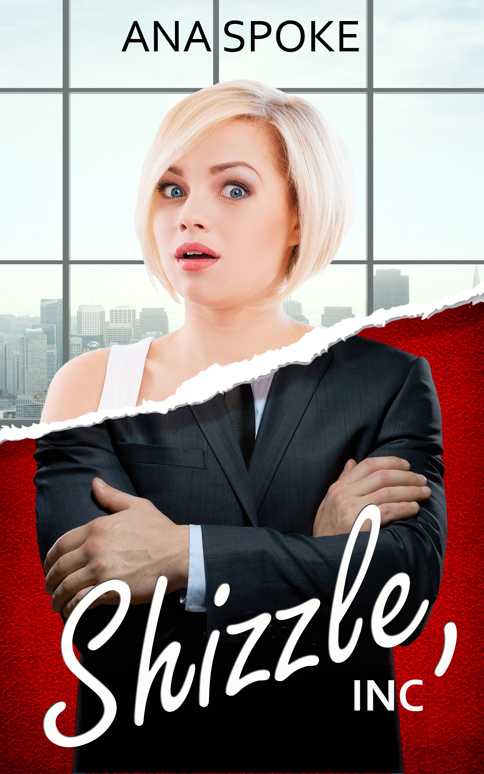
I have decided to move away from the double-rip, the last version of which looked like this:
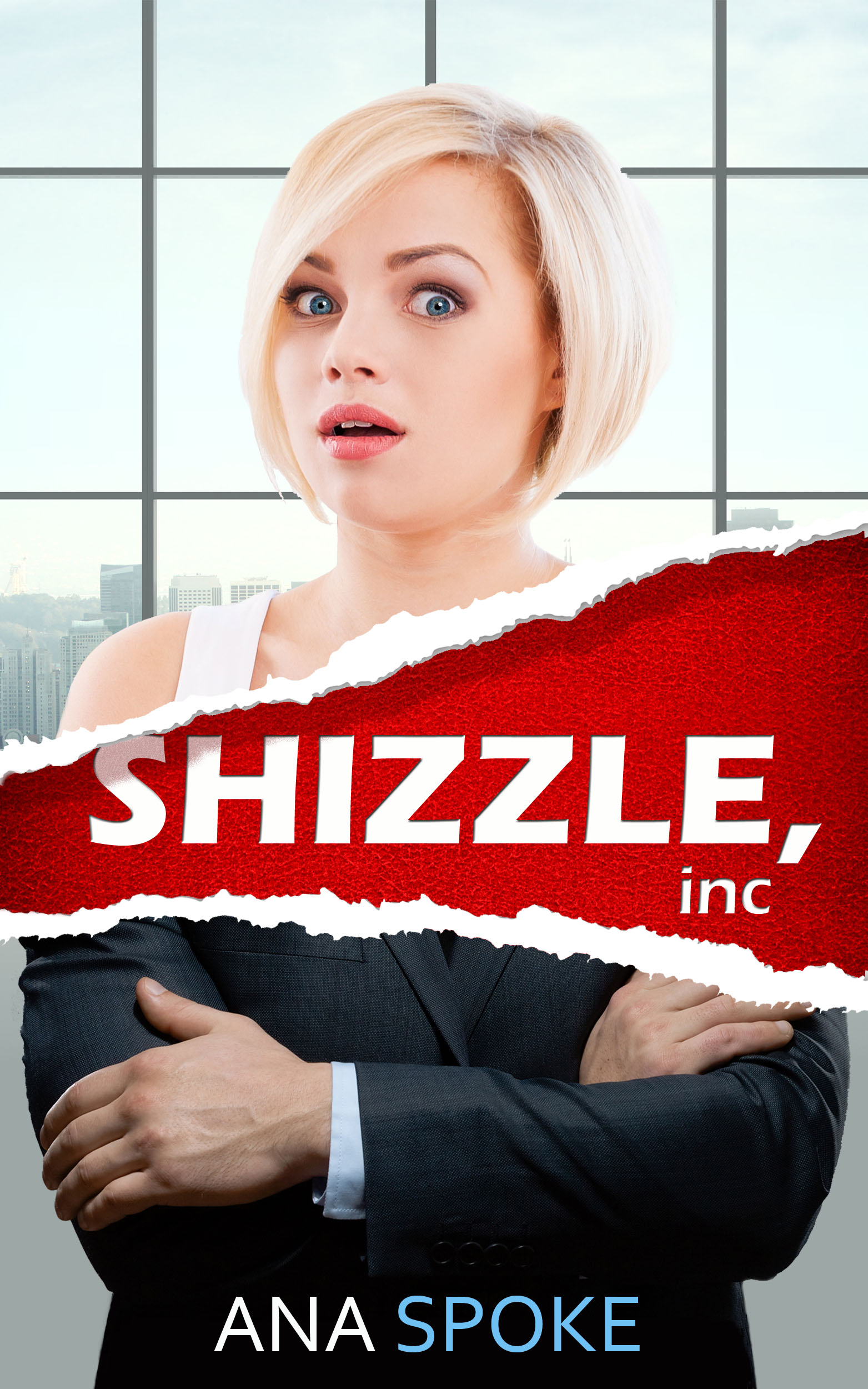
Once again, I’d love your comments. If you’ve had enough, I completely understand and promise that this one will be the very last post about cover design. Ever. Probably.


Hey Ana!
Hope this isn’t too late, but I’m really feeling the bottom one, with the double rip. I also prefer the placement of your name better on the last one, with two different colors for your first and last name. I’m not a fan of the top two covers’ placement of your name– because of the window pane, it looks like your name is off-center, even though it may not be. That would bother the hell out of me every time I saw it.
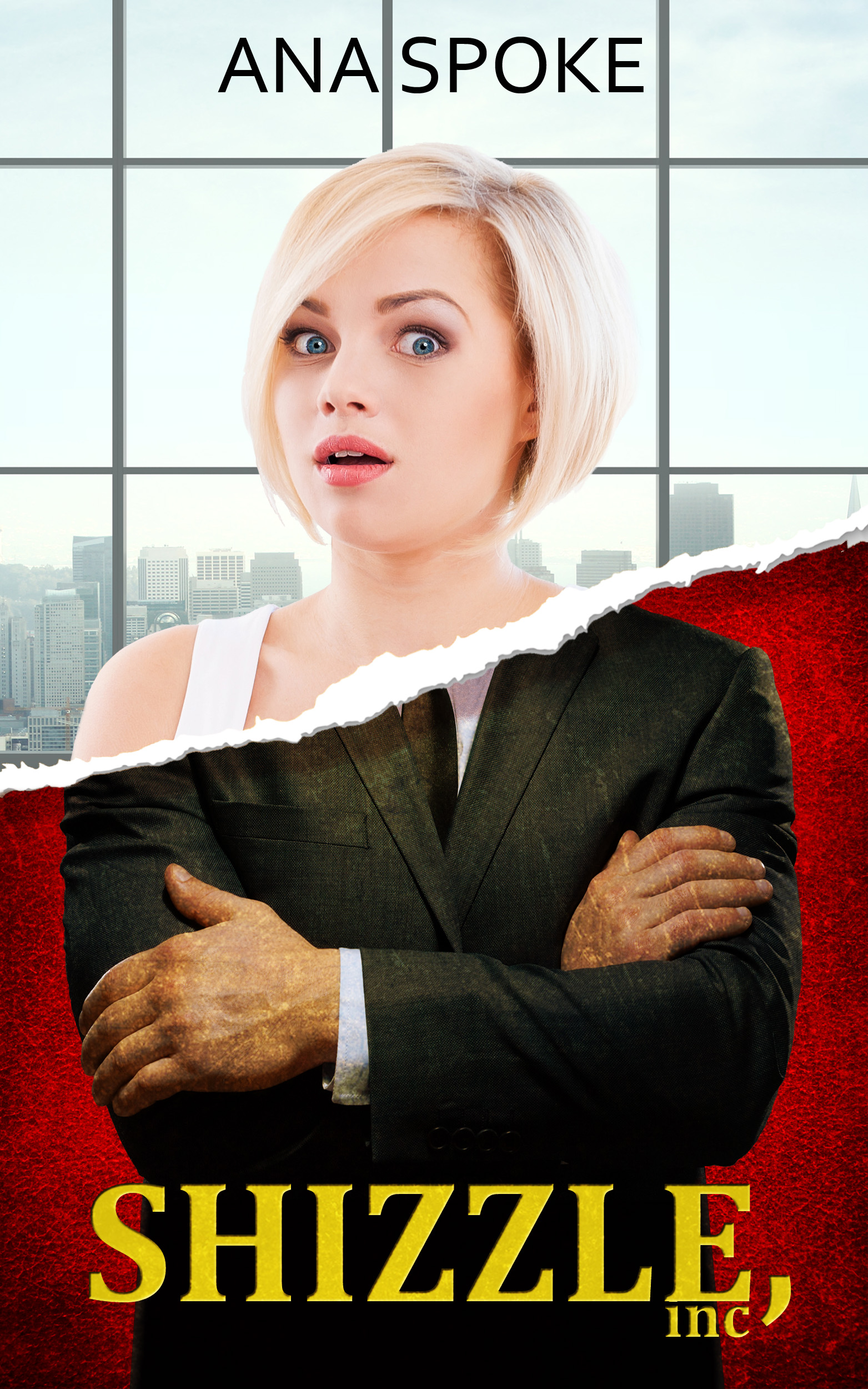
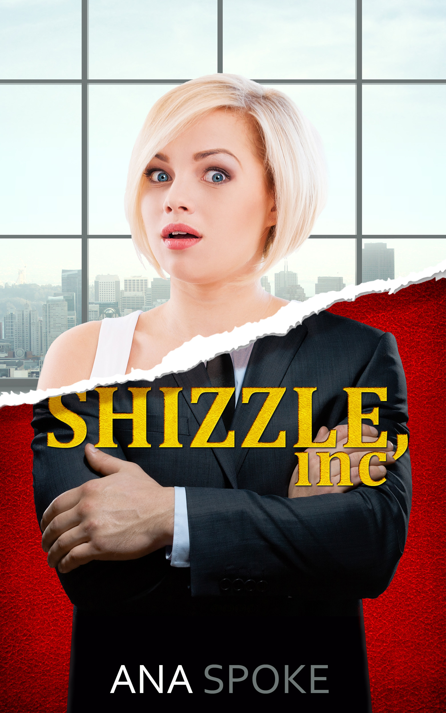
I’m not a huge fan of the fonts the word “Shizzle” is in for the top 3 covers, I honestly would dismiss the book based on the fonts alone, if I saw it in a bookstore. They look a little too… Chick-Lit-ish (sorry!). I quite like the font “INC” is in on the first cover, though, have you considered doing “Shizzle” in that font? Also, “INC.” looks more finished and polished than “INC”.
Lastly, the businessman’s hands are quite meaty. I much prefer the hands from the previous covers you previewed, with the watch and all. Would you consider using a businesswoman for the bottom half of the cover? Or is the man a reference to something in your book? Haha.
You said nitpick, and I definitely did… hope that’s alright. I look forward to seeing what you decide on!
LikeLike
Hi there, Darling Chay! I did end up going back to the double rip, partly because of so many people commenting about it, and partly because it helps to frame up the title. I am not finished yet, because I just. Hate. Every. Font. It has been the hardest, especially because I’m not allowed to download specialty fonts (work computer, ughm, don’t ask…).
I’m hoping to have one more go this coming weekend and commit to something I can reveal as the “final”. Which will probably be “t-minus 20 versions”, but oh, well…
LikeLike
Top one sells the story best. Good luck with everything.
LikeLiked by 1 person
Thank you Jame! Anything in particular you liked about it?
LikeLike
Cleanest line between the male and female figures; the font was the most appropriate for a comedy; the location of the texts was the most straightforward. I felt number 4 with the ripped text was too much, although its boldness is an asset. You have to decide if the emphasis should be on the title or on the male/female image.
LikeLiked by 1 person
Thanks again Jame! I have not finished the latest, but I am going back to the double rip specifically for the emphasis on the title. I am, however, changing to a more script font. Choosing the font is the hardest…
LikeLike
I like the top one. It just seems to be more eye catching. Best wishes!
LikeLike
Thank you!
LikeLike
HI Anna! Nice to know you, just starting to be active in blogging again after some time. I think I will go with the double-ripped one. It has most dramatic effect for the cover. And as I’m new here, can you tell me what this book is about? so I can have better view on which to go, thanks!
LikeLiked by 1 person
Hi and thank you for your interest! I am actually going back to the double rip, so many people commented that it gives more emphasis on the title and creates that effect of “schism” (I think!) between the male and the female. The book is about a naïve yet street-smart 20-year old girl, who is obsessed with celebrity and fame. By sheer chance she gets a job as a billionaire’s right hand and…I’m not sure how much to reveal 🙂 I guess I better start working on the promo blurb 🙂
LikeLike
LOL I thought people already knew about the synopsis of your book so I asked, apparently still a secret! Okay Ana, look forward to your book, will the original version (English) be available soon in other countries like Indonesia?
LikeLiked by 1 person
🙂 I just need to think about it more, the synopsis is an art in itself. The English version will be on Kindle, my current understanding is that it will be available in just about every country 🙂
LikeLike
Noted with thanks, Ana! Wish you success!
LikeLiked by 1 person
I like the top one because of the type you used. Very eye catching! Terrific cover. 🙂
LikeLiked by 1 person
Thank you so much! I’m using this font with the double rip…hope to finish the design this weekend.
LikeLiked by 1 person
It may be too late to comment on this – but I prefer the bottom one over all the rest. It seems more balanced to my eye. Personally I’m more attracted to that one.
LikeLiked by 1 person
Thank you! No, it’s not too late, and in fact, I went back to the double rip due to the responses. I will post an updated one tomorrow, I have used a more script-like text.
LikeLiked by 1 person
Pingback: Sequel to Shizzle, Inc – title and cover mock up reveal! | AnaSpoke.com