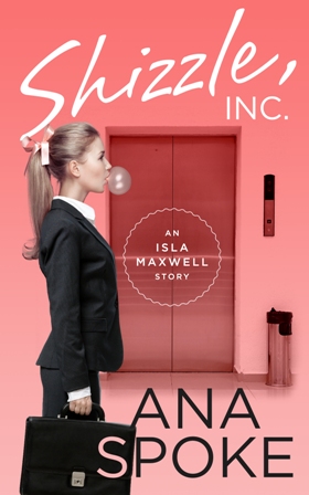
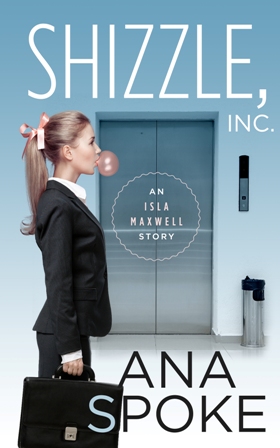
I finally got my draft cover from the designer! Maybe because the buildup to this day was so intense, I can’t help but be a little disappointed. I know it’s just the concept, and it looks professional, but at the first look neither one of the two versions grabbed me:
After a few hours of staring, however, it occurred to me that it’s not about whether I like it, it’s all about whether you do. Do you? Please let me know what you think. I’ve decided to wait a couple of days before I get back to the designer, but here are my thoughts so far:
What I DO like about this concept:
1. It looks like a “chicklit” cover, which is helpful for potential buyers.
2. It’s simple, with bold lettering.
3. Cute treatment of the “S” in my last name.
What I DON’T like:
1. It’s not funny or original and does not let the reader know that it’s a bizzare comedy.
2. It’s static and the girl has no emotion. None of the adorable innocence and bewildered ignorance of Isa.
3. The lift does not say “corporate offices of a billionaire”. It looks like she’s just going to work in any office.
4. The title and author name are competing in size.
This was my mockup, provided to the designer:
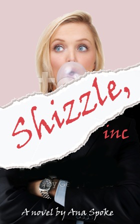
I wanted a juxtaposition of a bubbly girl and a cutthroat corporate world. The torn paper represents the chaos Isa brings to the empire of Shizzle, Inc. Once again, though, it’s my opinion. What do you think?


I noticed that the people that liked this blog haven’t really helped you.
I really like the mockup and the blue version.
If the blue and read version of the cover are your only options you have my vote for the blue cover 🙂
LikeLike
Thank you Jason! I was hoping for constructive comments like yours…I will pass it and my own thoughts onto the designer and see what he could do. Much appreciate your input 🙂
LikeLiked by 1 person
To be honest none of the covers relay what you said you wanted them to say. On your cover the Shizzle covers everything and doesn’t get the point across about a cutthroat corporate world. You don’t notice your name at all or that the girl is anything. In all of the covers the bubble seems to portray someone who doesn’t take their work seriously. A good background would have her going into a billionaire’s corporate office. I like the girl’s look better on your cover but she is covered up by the Shizzle.Try putting the ripped Shizzle above her head and the offices behind her. An Isa Maxwell story across her body and your name at the bottom of the page. I think this would tell your story better. If you have to pick from these three the red cover pops the most and would attract the eye best. Hope this helps. I’ve been an avid reader all my life and did a little writing, too.
LikeLike
Thank you Olivia, much appreciated. I have passed all the comments onto the designer. It was my feeling, too, that none of them hit the spot…hopefully just not yet. The designer has a great reputation online and some awesome examples of previous work, hopefully he transforms the concept…will keep you posted 🙂 A nerve-racking process for a first-timer…
LikeLike
I prefer the blue over the red. I can see where your concerns arose after reading your comments. For me, I did see the humor in the cover. I know I would pick it up! Hope this helps you 🙂
LikeLike
It does, thank you! I’ve passed the comments onto the designer, fingers crossed he comes back with a new and improved version 🙂 I will post the progress.
LikeLiked by 1 person
Your mock up is better than the two by the designer. Work with that, and get what you want. You know your work better than anyone else. You know what you want to portray in the cover. I sent an excerpt from my novel to the cover designers, and told them exactly what I wanted. They more than delivered. I was really happy with the cover. Check it out on Fellowship of the Snow Leopards. Best of luck!!
LikeLike
Thank you for your support, Joy! And congrats on publishing your book!
LikeLike
Thank you so much! I know you will get the perfect cover. So excited for you!
LikeLike
Pingback: Do you prefer the apple or the orange? | AnaSpoke.com
Hi Ana – I used to work in advertising so hope my advice helps.
My reaction on looking at the covers was similar to your points. Personally though, I wonder if the girl should be in the lift, surrounded by corporate types, the insides of lifts have more associations (think of Intolerable Cruelty, Working Girl, corporate theme movies). Alternatively, it could be illustrated, rather than photographed, I guess. Or, does it need the pictures at all? – a good catchline is a great seller – words paint pictures too.
I’m unsure about the gum, it tends to make people look like airheads or a bit young. Is she, or is she smarter than that? I don’t know what your protagonist is like so I’m just advising re. the association. You may want your heroine to be fun, but be careful because you can put people off too.
Red is a more lively, active colour, blue more relaxing, depends on the ‘feel’ of the story, I think.
Overall, I’d say follow your instincts, but look at a few similar-type books’ approaches too. People really do judge books by their covers.
Decisions, decisions!
LikeLiked by 1 person
Thank you! I would greatly appreciate a pro opinion, but unfortunately those designs were done by a designer, I didn’t like any of them, and we hparted ways. What do you think about these: https://anaspoke.com/2015/08/02/i-need-a-deadline/
LikeLike
Pingback: Another (designer) bites the dust… | AnaSpoke.com