Have you worried yourself sick over which one of these companies to pick as your PoD? Well, the good news is that there’s no need to stress – if you are planning to publish a fiction novel without graphics (as in the case of my book), then, in my opinion, one is as good as the other.
I have now published with both, mainly to:
- Save on shipping costs. When I run Goodreads giveaways, I can now send a book to the winner directly from either publisher, depending on which option is cheaper. I also get to order cheaper, locally printed copies for my promotional mayhem in Australia.
- Lightning Source allows a “return” option, which means I stand a chance of having my book ordered by bookstores, even though I take a risk of them returning my books at my expense.
Publishing with both was extremely easy, although Lightning Source does charge a small fee upfront (was $50 AUD for me). There are very slight differences in appearance of the paperbacks, and I’ve tried to document them below.
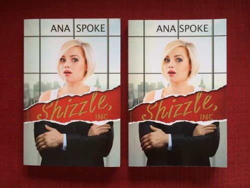
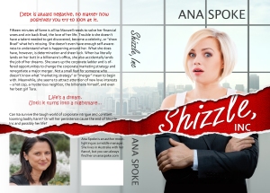
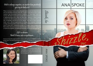
Let’s start with the first impression. Can you spot any differences? The Australian Lightning Source (ALS) version is on the left, the American CreateSpace (ACS) one is on the right:
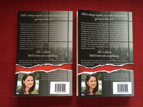
The ALS version (left) is slightly lighter/brighter – noticeable in the red and gold of the title. Ignore the spacing between my first and last name and the position of the small gold line near the spine – I did those tweaks. The slight difference in color can also be seen on the back cover:
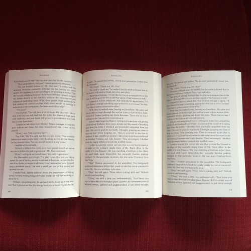
In both cases the printing is crisp – any differences/fuzziness of the font is purely due to my poor photography skills. The interiors are also very similar, if not identical (again, ALS is on the left/top):
The paper feels identical, although maybe, just maybe, the ALS is slightly smoother and ACS is slightly softer. The only (annoying) difference was that ACS did not want to lie flat, whereas ALS opened easier. This may be due to the differences in binding.
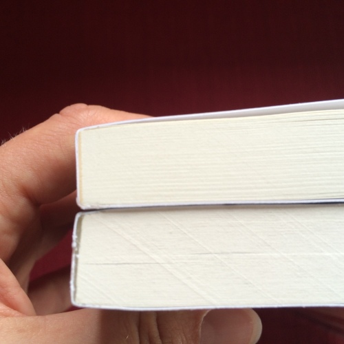
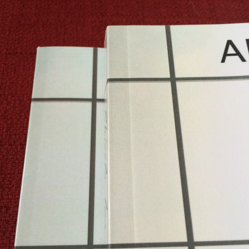
Speaking of binding, this is where I finally noticed a difference. In the photo below ALS is at the back (so the top of the photo). The ACS is next to my thumb.
ACS is thicker! Not by a huge amount, but it is probably due to the thickness of paper, so please make your own conclusions. For me, this is good news for when I mail signed books – both can be mailed as a “letter” at 248 pages (6×9 inch format), but it may mean that if my next one is slightly thicker, I may still be able to pay cheaper postage for the thinner book. The thicker book, on other hand, may appeal to others as more substantive? Also, not sure if it will last longer – but does that really matter with fiction paperbacks?
One last small difference in binding is the groove along the seam. ALS is on the bottom/left:
The groove is much more pronounced on ACS and is further from the spine (which explains why it is harder to keep ACS open). Does this mean it’s a better/more secure binding? I don’t know, but so far it doesn’t seem like either one will be losing pages soon.
So there you go, more info for you to mull over. Or, perhaps, to ignore? I’d say take a plunge and publish with either one – you won’t be disappointed 🙂

