Tag Archives: novel

T-minus 12 hours and counting! Plus some random Kindle formatting tips..

Today I’ve uploaded Shizzle, Inc text to Amazon. My whole body was shaking as I did it. About half a dozen times.

Turns out that my premonitions about formatting mishaps were true. There were not that many, and I resolved everything in a space of a couple of hours, but here’s what I’ve learned in the process:

First, the good news:

  1. Uploading your book to Amazon is RIDICULOUSLY EASY. Fear not if you’ve never done it before. Assuming you already have an Amazon account you’ve used to purchase books. Otherwise you have to set one up, and it would probably take twice as long. It’s literally a couple of pages and takes about 10-15 minutes. You can preview your text, make any changes in your Word file and upload the new version (takes about a minute).
  2. Note: you can’t have multiple accounts with Amazon. If you use a pen name, it would be a matter of setting up an author page under the pen name, which I’m yet to do.
  3. If you are a first timer, like me, use Word to write your book. I can’t really talk about Scrivner since I’ve never used it, but why complicate something that is already complicated enough? I credit the relatively easy conversion of my text with the fact that I’ve used good ol’ Word.

The not so good news:

  1. I’ve spent an exuberant amount of time fussing over the drop caps and inserting them into text at the beginning of chapters and then again at scene changes. I’ve previously used asterisks in the middle of the page to signal a change of scene. Finding and replacing them was a lot of work, so you can imagine my disappointment when in Kindle they displayed so far below the first line, they looked like “buried caps.” I tried googling solutions, but the consensus was JUST DON’T DO IT. So I spent more time going back and trying to figure out how to highlight the first line/first letter. In the end, I’ve decided to do nothing.
  2. You don’t need to stress over the fonts because Kindle will translate whatever carefully chosen font into its own standard. This could even be considered good news, if IT WAS BROUGHT TO MY ATTENTION LAST WEEK, before I spent hours researching, changing, trying out, and changing the font again.
  3. Make sure that you use the style “Headings” for your chapter names and not “Chapters”. Otherwise your table of contents will be empty. Hey, it’s an easy mistake to make! I actually decided to take “Chapter XX” out altogether in the end, and I think it makes for a cleaner, simpler presentation.

The most amazing news:

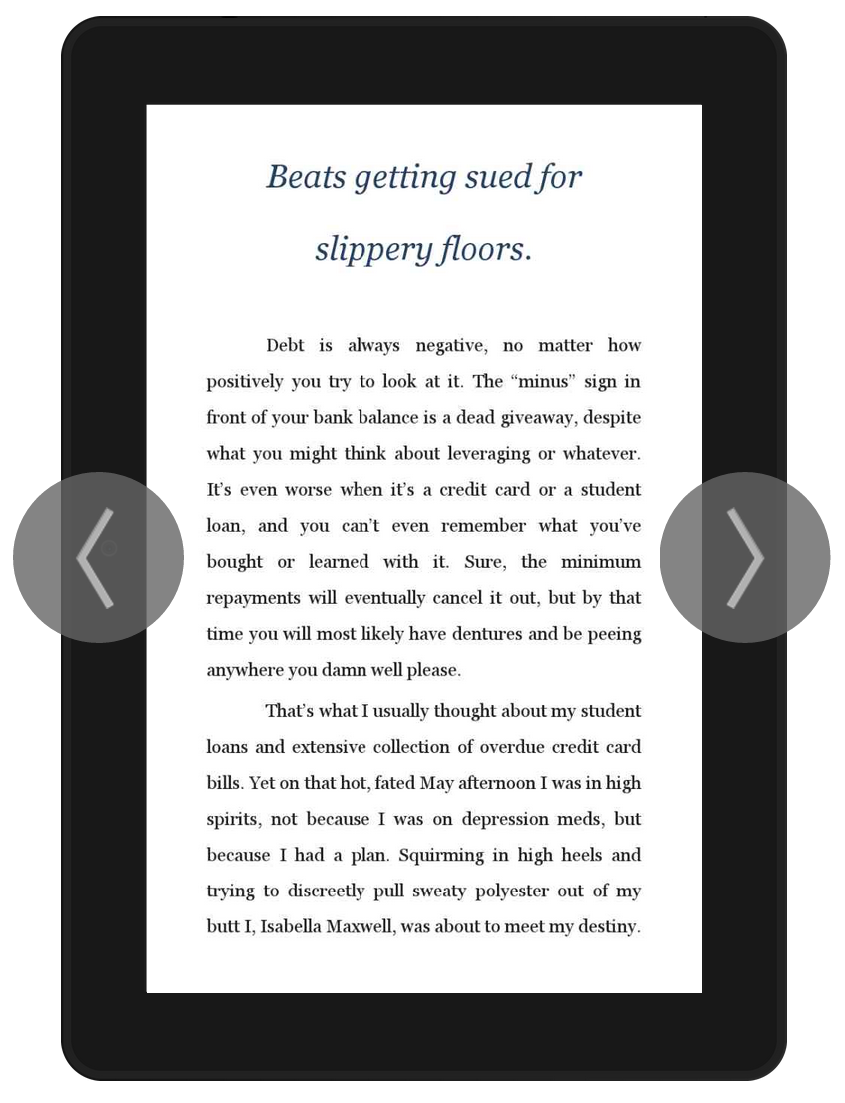
The text has been uploaded! No more editing! (Unless of course one of you points out a really stupid mistake and I fix it, but let’s just keep it between friends, okay?). This is what it will look like on a Kindle device:

Screenshot (9)

I could have published it already, but I just have to have one more fiddle with the cover image. I’m going to bed now, along with all other Australians, but will be up bright and early to finish it up. That’s if I can sleep at all 🙂

34 Comments

Filed under Self-publishing and marketing

Just a little progress

I’ve been sick for a few days. It’s winter here, down under, and it doesn’t help that I use public transport to get to work every day. Nothing like packing into a tram with a hundred other coughing people on a dreary gray morning, to remind me of my Soviet era childhood. Needless to say, I’m not at all nostalgic about it. I took a sick day and tried to sleep it off, but my brain is still no working so good.

Despite the general mental fog and lack of interest in anything outside the bed, I’ve managed to progress a little. First of all, I’ve made a decision on what to do about the proofread. Thank you so much to everyone who took time to read and advise me on my latest predicament. I’m going to persevere with the option #2, which is to get back to the editor and resolve what I perceive to be issues. I’m currently going through the manuscript, from the beginning, compiling a list of all the changes I don’t understand or agree with, and hope to send a complete list to her later today. In the process of doing it, I’ve realised that she’s actually done a good job overall, very thorough. I’ve also realised that I have a ready editor right next to me, in form of my fiancĂ©. Why it has not occurred to me to ask him before, I’m not sure (refer mental fog), but it turns out his private school and uni education is worth something :-).

There has also been progress on the cover front. Due to popular demand from the focus group (thank you so much again!!) I have reverted back to the double rip, but used the more script-y font:

latest 16 August

It’s not finished yet, but I think the future changes will be very minor, as in fiddling with font color or placement, and maybe color saturation or overlays. There will never be a perfect cover to please everybody, but I’m quite happy with the feedback so far, which suggests that it’s catchy and interesting enough. I have certainly loved the process of working on it myself.

So there you go. Not too bad for the sneezing, coughing, mess that I am at the moment. Back to bed, I guess 🙂

45 Comments

Filed under Self-publishing and marketing

The never ending cover story

Ok, I know you’re sick of this by now, but…Just. One. More. Time.

At least I’ve managed to pick one of the two concepts. I went with the more literal one, which also happens to use a face. The research shows that people respond to faces, and it also shows that I respond to research findings. So there you go, one decision made.

I’ve also spent hours searching Shutterstock for better images. Here are the previous version (on the left) and the new one (on the right):
Version 3 vs version 4
I’m practically in love with this new model. Not only her facial expression is spot-on, she’s also not stick-thin, like most of the pretty blond girls on Shuttersock. At one point, desperate, I was going to hire a model and a photographer, but I don’t think I could wish for a better girl.

I’m also happy with the background, which (when I pay and download a proper photo) shows a view of a downtown city. The colour is also fitting.

The man’s arms read better, but some people were confused and thought Isa just has “man hands”. May have to look more.

Not at all happy with lettering, but being an optimist, I’m sure a solution will come to me, maybe in a dream or in the middle of a meeting.

So there you go. One baby step closer to the finish. Brilliant ideas and suggestions would be much appreciated!

24 Comments

Filed under Self-publishing and marketing