Tag Archives: Book

Do you prefer the apple or the orange?

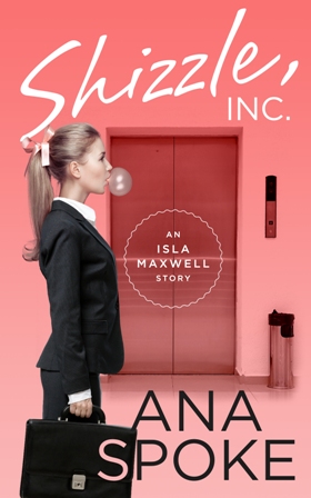
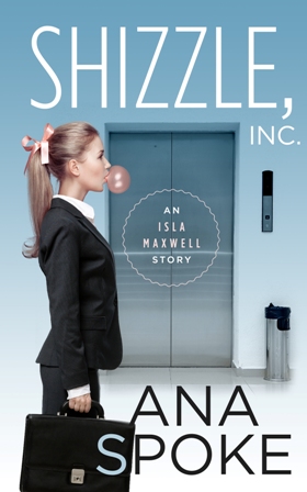
Well, now that I’ve decided not to use the pro to design my book cover, its time to put my Photoshop skills to where my mouth is…You may recall my frustration at the designer’s attempts to create a cover for Shizzle, Inc. Some of you have actually really liked his first concept. Choosing one is so hard!

I finally got a chance to spend a few solid hours on the concept development today and would love your input on my top two so far. These are just concepts, so please ignore the sloppiness of execution, resolution, and watermarks (I just need to sign up and pay for the images). Once I get my head around which way to go, I will further develop that one. Or start from scratch…
Cover mock up bubble girl and man arms2 Cover mock up 6

I know, they couldn’t be more different…so which one do you like? The apple or the orange?

22 Comments

Filed under Self-publishing and marketing

I need your help!

I finally got my draft cover from the designer! Maybe because the buildup to this day was so intense, I can’t help but be a little disappointed. I know it’s just the concept, and it looks professional, but at the first look neither one of the two versions grabbed me:
ShizzleInc_cover1 small ShizzleInc_cover2 small

After a few hours of staring, however, it occurred to me that it’s not about whether I like it, it’s all about whether you do. Do you? Please let me know what you think. I’ve decided to wait a couple of days before I get back to the designer, but here are my thoughts so far:

What I DO like about this concept:

1. It looks like a “chicklit” cover, which is helpful for potential buyers.
2. It’s simple, with bold lettering.
3. Cute treatment of the “S” in my last name.

What I DON’T like:

1. It’s not funny or original and does not let the reader know that it’s a bizzare comedy.
2. It’s static and the girl has no emotion. None of the adorable innocence and bewildered ignorance of Isa.
3. The lift does not say “corporate offices of a billionaire”. It looks like she’s just going to work in any office.
4. The title and author name are competing in size.

This was my mockup, provided to the designer:
Cover mock up bubble girl and man arms

I wanted a juxtaposition of a bubbly girl and a cutthroat corporate world. The torn paper represents the chaos Isa brings to the empire of Shizzle, Inc. Once again, though, it’s my opinion. What do you think?

13 Comments

Filed under Shizzle, Inc.

Dundee International Book Prize wants your first novel!

Something to brighten your day, fellow aspiring writers! How would you like to join the ranks of nine writers, who’s careers took off after winning the prize, or the 10,000 pounds, easily exchanged into your native currency?

If you said yes to one or the other, then have a look at the press release and make sure to submit your debut novel by 4 March! Good luck!

3 Comments

Filed under General thoughts