Yes, that’s right – I am holding a Rafflecopter giveaway for a $20 Amazon electronic gift card. Why am I doing this? As usual, there’s method to my madness, or at least that’s what I keep telling myself…
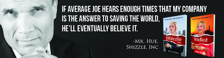
I want to get a BookBub promo, come hell or high taxes, and I am hoping that getting followers on their website would help me do just that. BookBub rejected Shizzle, Inc (Isa Maxwell escapades Book 1) for the 4th time, despite it gathering over 40 reviews and currently ranking in top 100 of the entire Free Kindle store. The high ranking is due to a promo, which netted almost 2,000 downloads in two days. I will have a review of all my May permafree promos after the end of this month, but for now, thank you eReader News for this:

Still, to get to my goal of 100,000 downloads by the end of the year, I will need to catch that elusive BookBub promo prize. It alone can potentially net me 20 thousand downloads for a very reasonable $70 (chicklit category is the smallest one). So instead of wallowing over another rejection, like I’d originally planned, I’ve made an action plan of how I can win over those stern BookBub editors. I find action plans in general soothing, but this one, in particular, is Aloe Vera for my burned ego.
This is what I’ve done or will be doing over the next month:
- Enticing people to follow me on BookBub with Rafflecopter giveaways. Yes – more than one. I’m starting with a $20 certificate and will report on how many, if any, followers I will get. If it’s successful, I might try a $50 gift card next time.
- Revising my book covers to look like a series. This seems to be one of the factors people mention – professional-looking covers with great typography. I will be keeping my designs almost the same, but taking the “rip” effect across the series and getting a professional to help choose the typography.
- Re-editing Shizzle, Inc yet again.
- I’ve revised the blurb for Shizzle, Inc and the editor will check it as well. If anyone has any comments on the Shizzle, Inc blurb
, I’d appreciate them!
- Already added Indiot to my BookBub profile.
- Updated my bio everywhere, including my Amazon Author Page. What do you think? It used to be one pathetic sentence…
- Already added a”follow me on BookBub” button to the right-hand side menu on this blog, using these directions and my own image widget directions.
- Added a “follow me on BookBub” link to my email signature. I don’t use it that much, but why not? Set it up once and never have to think about it again. My signature also has links to both of my books on Amazon now.
- Created this ClickToTweet link, which I can add to posts, author bio, etc. You can create your own on Click to Tweet website, free of charge.
- Will get even more reviews via the continuous free giveaway and using a NetGalley co-op.
There. I can apply to BookBub again on 10 June, and you better believe it – there is a reminder in my calendar to do it once a month.
I have a gut feeling about it. It could turn out to be gas, but once again – time will tell.


I admire your dedicated plan. You really provide an excellent example of how to market yourself. Thank you yet again.
LikeLiked by 1 person
Thank you TA 🙂
LikeLiked by 1 person
Brilliant… again!
LikeLiked by 1 person
Thank you, James 🙂 I hope it is – time will tell…
LikeLike
Sounds like a great plan. However, I would suggest reconsidering #2. As a professional designer, I think the covers work very well for each book as they are. I think trying to force the rip effect across the cover of Indiot will make the cover look odd. The only way I see it happening well is if you do the rip where you currently have the fabric going across her face. And then what? Are you going to put the title there? Not sure if it works, because I like how you made it into a diamond necklace. If you add the rip effect, you might want to try and stick with the same font as well, and I don’t think the scripted font will work as well. But then again, I won’t know for sure until I see it… I could be totally wrong! : ) But the initial visualization in my head says different.
The only suggestion I have is to make the font of your name the same across the series (whichever you choose is up to you — the sans serif Shizzle font makes it a little more corporate, whereas the Indiot font makes it a bit more adventurous. Also, the diamond Indiot title (if you decide to keep it) could be shaped a little better and maybe given a string that wraps around her neck so that it actually appears to be a necklace. (Removing the outline of the letters and letting just the diamonds form the letters may also help this effect.) I think it makes the image a lot funner and helps it stand out more than repeating what you did on Shizzle. What holds the books together as a series is your cover model.
But that’s just one man’s opinion. Good luck with everything!
LikeLiked by 2 people
Thank you, Bryan – you’re a designer, too??
Well, maybe I’m overthinking it – I’ve been on KBoards for a couple of weeks and all the established authors (mostly of fantasy and romance) have series with matchy-matchy covers. Originally, my intent was to buckle this trend, and then I couldn’t help but think that they know something I don’t. I was even going to scrap my designs at one point and get a designer to repackage them all, but a couple of designers I’d contacted for quotes said they really liked the covers, so I changed my mind and decided to tie the covers together with the rip and same title fonts. To be honest, my mind is going nuts with all of this – I still am enjoying the publishing process enough, but I can see why in the future I’d love to “sell out” and let somebody else handle those aspects.
I might try some pock ups with the rip and post them for comment – that way you (and I, too) could see what that would look like. I do agree that funny has to come first.
LikeLiked by 1 person
I am… you may recall when you ran your first cover design contest that I offered to give the second and third place winners discounts on cover designs. Nothing happened with that, but yeah, graphic design (with a little bit of writing and video thrown in) is my day job until the writing takes off!!
I totally understand being overwhelmed and conflicted, especially when there are so many conflicting opinions out there. And creating covers that match a theme throughout a series isn’t wrong (in fact, I’ve done it with the sci-fi series I have going on), because it allows readers to have something familiar to associate the book to, but it’s certainly not necessary. As I said, having the same cover model clearly depicted on the cover, and maybe one or two similar fonts, is plenty to give the reader that association. What’s most important is whether the cover displays the essence of the book and I think both covers as they are do precisely that.
But I am interested in seeing what the cover might look like with the rip if you do decide to mock one up to get others’ opinions. Just know that, to use a well-worn cliche, at the end of the day, you have to trust your gut.
LikeLiked by 1 person
Oh, yes – now I remember! Sorry it didn’t work out – do you want to do a guest post and feature some of your designs?
I’m pretty excited about the rip – I’m almost done not only with Indiot, but with the third one as well. Will post all three by tomorrow
LikeLiked by 1 person
That would be terrific. May I be able to do the guest post next Friday, June 3rd, to coincide with the release of my new book?
I also commented on the new cover design on Twitter… and noticed how many people liked the rip! : ) Good job.
LikeLiked by 1 person
Yes, Friday is great – send me your text, cover, bio, and photo. Oh, and suggestions on the post title, if you have them.
LikeLiked by 1 person
Okay, great. I will try to send most of the stuff over by the end of the week. It might take me the weekend, into early next week to finish the full post, though. Thanks again. Appreciate it!
LikeLiked by 1 person
That’s fine, I’m happy for you to wait and send it all together as one complete package – less chance of me getting confused.
LikeLiked by 1 person
Okay. You got it.
LikeLike
#2seems to work a bit better than a book that promises a continuation at the end of the book.
LikeLiked by 1 person
Thank you, Tony – sorry, this is how the second one ends, too. Resolves the current plot and then sets up for the next one. Please don’t hate me too much 🙂
LikeLike
I’m following you on BookBub now.
I agree with Bryan’s comments about the cover.
Am not sure about the words “constant looming bodily harm” in your description. I had to read it twice to get the sense of it, but found it funny once I did. Maybe I was being thick. I’m guessing it sounds like the sort of word combo that Isa would use, so maybe it sort of conveys something of her. Generally, I like descriptions that are short and to the point, which yours is, so that definitely works. I know that it has taken me 6 months of footling with my description before I’m finally happy with it, but my sales might have been better if I’d got it right in the first place. The thing is, I can’t remember there being much wrong with your original description which certainly didn’t get in the way of you selling numerous copies. On the other hand, it is important to get it so that you’re totally happy with it, as it helps you sell copies with absolute self-belief in the whole package.
LikeLiked by 1 person
Thank you, Sarah, and thank you for your comment. Who knows what is a perfect blurb – you can’t please everyone with the book itself, so different blurbs would work for different people. One of the issues I’m thinking I need to address is to let people know in the blurb that this is not a romance and it’s bordering on ridiculous. I don’t want any more 1-star reviews 🙂 I think the continuous messing with the cover and blurb is part discovery and part anxiety…
LikeLiked by 1 person
I would have been gutted by that 1-star review. That person obviously didn’t get your book at all, so I know what you’re saying about making it clear that it is ‘meant’ to border on the ridiculous! I’ve been working long and hard on making it clear from my blurb that my book is quirky and meant to read like alternative sci-fi or the plot for a B-movie 🙂
LikeLiked by 1 person
Yes, and in the process of cover redesign, I found out that many people did not realise mine is a comedy, based on the covers! The original Indiot was apparently looking like a “women’s issues” book to some! Glad I dodged that bullet…
LikeLiked by 1 person
Too right. That is definitely a bullet to dodge at all costs! Don’t these people look at Amazon product pages properly? Duh! If it has that a novel is in the subcategory of humour, then it presumably means that it’s funny. I swear that people have got worse at reading things thoroughly. You only have to look at the comments in threads to know that. I remember reading the instructions for a writing competition, all laid out clearly, and then underneath was a thread that asked the very questions that were answered in the thread. I put a comment that said “Most of you wouldn’t be asking these questions if you’d bothered to read the competition rules above”. That was the end of the thread as, by some miracle, they read my comment.
LikeLike
Followed.
LikeLiked by 1 person
Thank you, Portia!
LikeLike
Oh, the Rafflecopter has not started!! Sorry, I thought it was my timezone…please check the link in 6 hours and thank you again for following me 🙂
LikeLike
Followed!
LikeLiked by 1 person
Thank you, Juli! Got 6 followers already 🙂
LikeLiked by 1 person
That’s great!
LikeLike
Oh, the Rafflecopter has not started!! Sorry, I thought it was my timezone…please check the link in 6 hours and thank you again for following me 🙂
LikeLiked by 1 person