Oh, the angst of book cover design! I have previously posted several times about my first experience with a designer, such as I need your help! and When does it pay to pay a pro? After a couple of attempts, we’d parted amicably and I then proceeded to design the cover myself, blogging about the continued angst in Do you prefer the apple or the orange? and The never-ending cover story. The final result is now on Amazon Kindle. I’ve had a lot of positive feedback on it, including from The Book Designer’s ebook cover awards!
Then, for whatever reason, when the time came to turn the ebook cover into a paperbook cover, I lost my cool. I decided to pay someone to make it better. What kind of pills do doctors prescribe for perfectionism combined with self-doubt?
Anywho, I’d contacted several designers and asked them to turn the existing design into a wrap. They all promptly turned me down, as they would prefer to do one from scratch and ram their ideas down my throat, but then one agreed. I was so excited! I thought it would be easy, too – I had the exact idea in mind, just wanted someone with excellent Photoshop skills, experience, and a keep eye to polish it.
The designer had one go and sent me a jpeg to review. I very politely explained that I wanted the rip to look realistic and that I wanted some kind of a cool treatment to the title. The designer had another go, slapping a stock-standard title font on and making a complete mess of my photo and bio. She finished the email with “let me know if this is good to go”.
I again politely explained that no, it wasn’t “good to go” and made a dot point list of what I wanted changed, attached photos of examples, and even a link to creating a realistic paper rip.
I got back an invoice with a link to download the final file upon payment. I replied that I was not going to pay, unless I had a look at what I was getting. I got a jpeg. Still a mess.
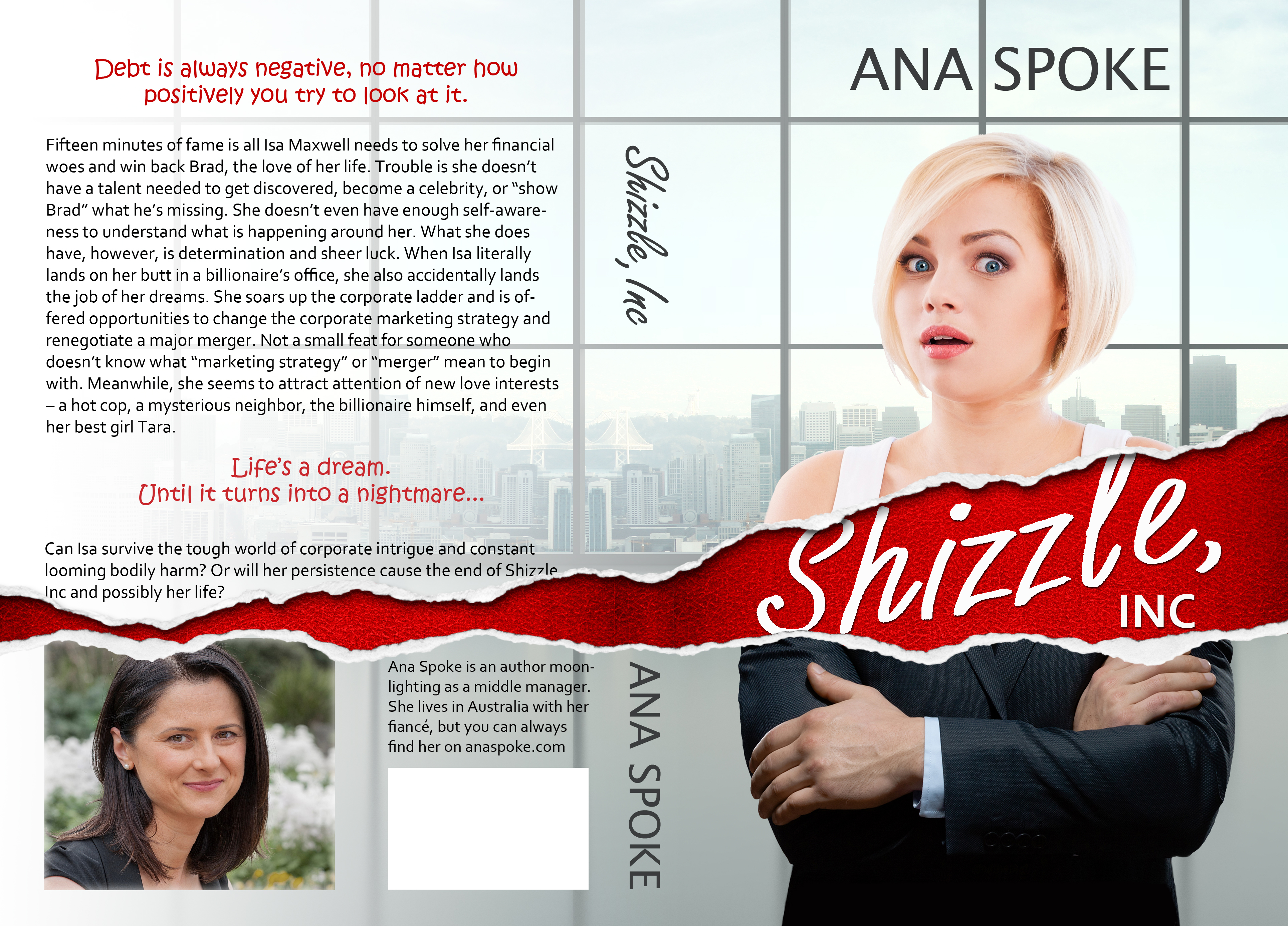
There were a couple more emails back and forth, rapidly decreasing in politeness, and I think we have now parted ways, albeit not so amicably. I have not paid, so I won’t reveal the designer’s name (unless we continue to battle over this). Instead of battling, I did the wrap myself today, in about three hours. Turns out, CreateSpace have a template creator which automatically makes a pdf with exact dimensions for you. Then it’s a matter of dropping in your existing cover layers, extending the background, and adding the blurb and bio. I’ve even bought a new paper rip photo from Shutterstock. What do you think?


I love your cover! You have some mad skills! (**secretly jealous **!!)
LikeLiked by 1 person
Haha, thank you! I did spend a couple of years as a landscape architect and Photoshopping design ideas for clients were part of my regular work. I’m actually amazed that I still remember how to do it a decade later…like riding a bicycle…
LikeLike
Way to go, Ana I do all my book covers for my books and ditto on the illustrators. I had two ask me for the money before I even saw their work on my project. It bees that way sometimes.
Keep up the good work. By the way I’m talking to the CEO at Create Space after their creator screwed up my book cover, as we speak, but they did refund my money for the proof.
LikeLiked by 1 person
Thank you 🙂 I can’t believe you could be asked to pay for a “cat in a bag”. Glad you are getting your money refunded, but you also have delays and lost opportunities…I’m just lucky to have some Photoshop skills, feel bad for people who have no choice.
LikeLike
Anna, I’m not a graphic artist, but I’ve (professionally) looked at thousands of book covers, and I suggest two tweaks: make your author photo a little smaller, and adjust the text so it doesn’t bleed into the tear. Hope this is helpful.
LikeLiked by 4 people
Thank you! I do agree that my photo should be smaller, but the reason for title and blurb getting cut off was to make the tear more realistic – the title is supposed to be underneath the torn dust jacket, on the leather-bound hard cover. Perhaps the title font still needs work to make it look so?
LikeLike
If that is what you are going for, yes, it needs just a bit of tweaking. the leather bound spine needs to be a bit more obvious. Maybe some additional highlight and shadow. The title on the leather would not be “lifted off” as it appears now. It would be indented into the leather. Perhaps a bit of depth around the lettering.
LikeLiked by 1 person
Yeah, I’m struggling with how to make the title imbedded – that’s why I’ve tried to pay someone 😦
LikeLike
That’s really good, well done 😊
LikeLiked by 1 person
Thank you, Susan!
LikeLiked by 1 person
Not sure I agree that the author photo needs to be smaller; but I do agree that the title should not bleed into the tear. I think the cover looks great! It’s very eye catching.
LikeLiked by 1 person
Thank you! It was intended to look like the title is on the hardcover, underneath the torn dust jacket. No?
LikeLike
This is great. Your cover is great! I totally understand the battle with perfectionism, and I wish docs did prescribe pills for it! But congrats for defeating it and in fabulous style too!
LikeLiked by 1 person
Haha, thank you Abigail! I just hope perfectionism serves us well in releasing quality books…always two sides to the same coin, right?
LikeLiked by 1 person
It’s bitter-sweet, but so far so good! The reviews on your book are really positive. Keep it up.
LikeLiked by 1 person
It looks great. And well done for doing it yourself! I do agree with the comments from Change it up editing – about not having any text, or picture bleeding into the rip. Great design, will long fab in paperback.
LikeLiked by 1 person
Thank you, Suzanne! The reason I did it was to give the rip a more realistic appearance – originally I was going to cut off text in a spot where it almost made no sense. Still no?
LikeLike
I see what you mean about making the rip realistic. Go for it.
LikeLiked by 1 person
Yeah? Thank you 🙂
LikeLiked by 1 person
I love your cover! Nice job! I’m going through the same thing, but using Createspace with the pre-made cover I bought from a wonderful artist. Createspace wants me to move text in 0.25 so it doesn’t bleed, so I’ve contacted her and hoping to get that taken care of. I’m pretty pleased otherwise. It’s fun doing all this stuff as a self-published authors, right? 🙂
LikeLiked by 1 person
Thank you, Nancy! Yes it is, although sometimes it gets to be too much – hence why I tried hiring a pro again. I do love having control over content and look, and having quick access to change things – waiting is the hardest on me.
LikeLiked by 1 person
If you ever find those pills, let me know. I could seriously use some !!! Blessings ❤ Love your cover of your book !!
LikeLiked by 1 person
Haha! No, there’s no hope for us…
LikeLike
Love the cover!
LikeLiked by 1 person
Thank you!
LikeLiked by 1 person
You’re welcome
LikeLiked by 1 person
Reblogged this on devonrowebooks.com and commented:
I love the way it came out!! It’s a thousand times better than anything I could ever do alone!
LikeLiked by 1 person
Thank you, Devon – and thank you for sharing!
LikeLike
I think it looks excellent, Ana. I’m a ‘newbie’ too, as you know, and firmly believe that all us folks are best placed as indie authors to do as much as possible ourselves. Nice one! 🙂
LikeLiked by 1 person
Thank you, Cee Tee 🙂 I would love nothing more than to find a designer that “gets” my books and also is a perfectionist in execution, so I will keep on trying.
LikeLiked by 1 person
The cover looks great. The model’s expression is a perfect match for the back cover blurb. I actually like how the text is ripped too. Overall it communicates fish out of water comedy/romance.
LikeLiked by 1 person
Awesome, thank you, Jim! I’ve searched and searched for her, and luckily there are a couple of other photos of this model with equally funny expressions, so I’m set for the sequels 🙂
LikeLike
I like it but I wish that shizzle didn’t get lost in the text.
If you do decide that you want to try something else though, my best friend is an illustrator and knows Photoshop really well. Let me know if you are interested and I can give you her contact information and show you some of her work.
LikeLiked by 1 person
I’ll go ahead and leave her website URL for you to check out. I know she’s done at least one book cover before. The link is http://liztatom.com
LikeLiked by 1 person
Omg, she’s an amazing artist! I just don’t want to anger any followers or their friends with my picky ways – I have already made two designers unhappy 😦
LikeLiked by 2 people
I can say that anything you do with her would stay between the two of you if that’s the only reason you are hesitant. That’s why I gave you the direct contact since I no longer have anything to do with the situation if you chose to contact her. You seem to be a professional who handles things with class much like you are now by not saying who has angered you. I’m not the sort of person to take sides when it comes to business. She’d probably appreciate someone who knows what she wants since I always never know and have her try to figure out what I want, lol. O can say she’s very flexible and understanding in my experience.
However, you are fully capable of making your decisions, and I fully respect that. I just wanted to provide you with a contact in case you might still want to find other options since you still didn’t seem satisfied. I just know your book is your baby and you have given me such insight into the self publishing industry that I want to find a way to give back to you. You know, indies helping indies! 🙂
I hope you end up with a cover you love and feel proud of!
LikeLiked by 1 person
Thank you so much, Kristina, you’ve been so incredibly supportive! I might contact her, then, because I’m still hopeful to find a designer with whom I can work on an ongoing basis. For this one, I just want a bit of polishing, but as my leave is getting approved next week, there will be two more in rapid succession!
LikeLiked by 1 person
I’m glad you find me supportive. I was worried after I reread what I wrote that it came across as too forward. I just wanted you to know that I didn’t think you and I would have a problem if you chose to work with her if that was the only hesitation since I myself have done business with her for my own novels and we still remain friends.
I hope it didn’t come across as anything other than that! If so, my apologies!
It’s getting approved?! You already know or that’s when they will make a decision?
LikeLiked by 1 person
Goodness, you are so polite and nice in the way you phrase your feedback, I never once thought you’d stepped over the line! Thank you again 🙂
The approval has been along the lines of “I’m pissed off, but due to company policy, I can’t say no”. Hehe, I’ll take it!
LikeLiked by 1 person
Oh good! You can never tell how people will interpret things, so it’s good to double check sometimes! 🙂
Ah! I’m so excited that you are going to get it approved!! Congrats! I believe I read you are taking a honeymoon as well? Is the wedding in December or did I somehow miss it? I feel like May was a date mentioned too though for something? Or has my memory confused you with someone else?
LikeLiked by 1 person
No, no, you’re right – the wedding was going to be in December, but got moved to May. My mom can now come from Ukraine, where my parents still live. I do get two honeymoons 🙂
LikeLiked by 1 person
Well you have a lot of things to celebrate in the near future then! Congrats.
PS : I think an interesting topic to discuss might be how you managed to grow your blog too and perhaps even if you think it has helped you in promoting your book. I don’t know if there’s really a way to decipher how many sales are from clicks from your blog though.
I never realized you had so many followers until today, and I feel like you are getting more comments lately as well, at least if I judge the numbers alone. Or maybe I misjudged how popular you were when I started following you earlier this year, lol. Either way, congrats for that too!
LikeLiked by 1 person
No, you’re right – it’s exploding! I would say having Twitter connected (and I’ve been on Twitter, posting jokes, for about 3 years) has helped. Also my combination of comedy with practical advice is probably catchy. And finally, engaging – I answer all comments, I comment on other people’s blogs, I even answer on Twitter. I will keep this idea in mind, thank you 🙂
LikeLiked by 1 person
I guess it does all add up doesn’t it? 🙂
LikeLiked by 1 person
Yep, and then it takes off on its own – I have about 500 new people follow me on Twitter every week now, I can’t believe it.
LikeLiked by 1 person
That’s awesome! Congratulations! I hope I get to that point someday. 🙂
LikeLiked by 1 person
It says a lot about you that you are genuinely concerned but these are business transactions. Never be afraid of demanding what you pay for. I’m not saying it’s easy! It took me years before I was able to separate my sensibilities from transactions and I do them daily in my unwriting job.
LikeLiked by 1 person
Thank you, Jim – I seem to be ok with consultants in my “regular” job, all transactional, per spec. For some reason, it’s hard for me to deal with designers, perhaps because I used to be one (landscape architect) and had my fair share of unreasonable clients. Now I am the unreasonable and picky client…
LikeLike
While I love your cover, I think the suggestion about watching the print near the tear was a good point. It’s actually bleeding the lettering into the tear and cutting off the bottom of the z in Shizzle. Besides that, I think you did a great job. Certainly no worse than any of us who did take graphic courses and I’m sorry you’ve had such crappy luck with graphic designers. Sometimes it’s hard to realize someone else’s idea no matter how clear they are being about what they want. I use to see it all the time in another format and it was never a pretty sight.
LikeLiked by 1 person
Thank you – the reason for losing the lettering in the tear was to make it look more “real” – I will have another look.
LikeLiked by 1 person
It does look real. 🙂 I just wasn’t sure it was intentional.
LikeLiked by 1 person
Thank you, Kristine – I really appreciate your input!
LikeLike
I’m sorry you’re having so much trouble with your cover people.
I hope you find someone you mesh with in time for your next cover.
LikeLiked by 1 person
Oh, I would love that! I don’t actually want to do covers, although it was fun in a way 🙂
LikeLike
I would suggest tweaking the angle of the wrap on the back side. The angle on the front is too great for it to even out like that on the back. To make it look more natural, I would angle the ribbon on the back slightly more downward towards the bottom, and then switch the text and the picture so that the picture is on the right hand side and the text is on the left hand side below the ribbon. Once it’s on the left-hand side, I would line up the bottom of the text with the bottom of the picture (and make the picture slightly smaller). I would also cut off the ribbon so that it lines up with the left-hand edge of the text. Hope these suggestions help!
LikeLiked by 1 person
Also, if you need any help, I would be happy to do it for you in photoshop 🙂
LikeLiked by 1 person
I would love that, but I’m afraid that I might upset you if I decide not to use your changes – seems like I’m a very picky customer!
LikeLike
Thank you – I might play with my picture – perhaps it’s too large. The red bit is not a ribbon, though – it’s a “rip” in the paper cover, that is supposed to reveal a red leather hardcover volume underneath. In that way, a rip would probably narrow towards the end. I might rip some paper to check! This is also why it can’t stop abruptly, unless I end it with a curled up bit of paper – I’ve tried it, looked cheesy.
LikeLike
Not cover related, but still neat… Just went to pick up your book and it is the second search return for ‘shizzle’ on Amazon.
LikeLiked by 1 person
Awesome! Are you going to read it?? Please, please post a review (unless you hate it, then nevermind). I’m amazed that men have read it and actually liked it already – I would have never guessed!
LikeLike
Well, yah I’m going to read it. Wouldn’t have bought it otherwise. 😉
I love books from all over the place. I’ve found that enjoying a book generally has more to do with the writing than the genre.
And I’m happy to post a review. Probably won’t be until after November though. NaNoWriMo is devouring my book time.
LikeLiked by 1 person
Thank you again 🙂 Oh, and good luck with NaNo – hope you get to 50K!
LikeLiked by 1 person
Very nice cover. Good rip!
LikeLiked by 1 person
Thank you 🙂
LikeLike
Reblogged this on Anita Dawes & Jaye Marie and commented:
Girl, you ARE an expert! Great cover…
LikeLike
That artist’s cover was so crud. Your cover is brill and so captures Isa’s personality. Go for it girl. The wrap around is cool. You need to have the same front cover for your paperback as your ebook version.
LikeLiked by 1 person
Thank you, Sarah! Yes, once I finish the paperback, I will update ecover, although they don’t have to be identical – for example, lettering one books is generally bolder than on paper books.
LikeLike
Absolutely EXCELLENT Cover 👍👍👍👍👍 (5 thumbs up award) 🐵
LikeLiked by 1 person
Thank you very much!!
LikeLiked by 1 person
I like it :).
What is that saying? If you want something done right, do it yourself?
It seems you are proving it :).
I generally like the minimalistic artwork, there’s less there to tear the eye away from what’s important and you’ve managed that :). The minimalistic approach, that is.
LikeLiked by 1 person
Thank you! I might be just a tad controlling 🙂
LikeLike
Lol, that can be a good thing.
LikeLiked by 1 person
Looks good Ana! You’ve done a great job – I’ve stumbled through cover creation too – my mistake was using a picture with sufficient DPI on a kindle format, but then not being able to up that DPI for the print version. It turned into a complete redesign (and more changes to come)! I linked my woes to the bottom of the post if you want a good laugh at my misfortune, or you can just take comfort in knowing I’ve struggled with the designs too! http://www.thanekeller.com/2015/10/new-cover-design-2/
LikeLike
Thank you, Thane! In the future I will start with the paperback and then cut it down to ecover. I like your new design, my only question is philosophical – is it worth saying “a novel” on the cover? It has always puzzled me, as I’m not sure what it adds. Is that to emphasise that it’s not a short story? The reader will see the number of pages on Amazon.
LikeLike
I think you’re right – especially because after you format with Createspace, they provide the kindle files for you. I’ll be doing the same. It’s funny you should mention “a novel” We debated that back and forth and it seemed like lots of trending cover designs used “a novel.” It’s actually tradition back to the 1800’s when poetry, lyrics, and journals ruled the day. Distinguishing a novel back then was important. In the end, while novels are the norm and not the exception today, we decided to keep the tradition 🙂
Another note in the same vein on the part of a designer – I’m informed the additional text can help balance out a design if something is needed.
LikeLiked by 1 person
I didn’t know that CreateSpace do that!! Thank you, Thane!
There’s no right or wrong way for the design, but thank you for explaining your reasoning 🙂
LikeLiked by 1 person
Yeah! I didn’t know either until I finished the set up last weekend – definitely changing around the order of the next book now that I know – it seems there’s always something else to learn in the world of self publishing! 😉
LikeLiked by 1 person
Omg, me too! When I put my ebook out, I had no concept of where I was going to take it all, I was just happy to have something finished. I have a clear goal and a game plan now!
LikeLiked by 1 person
Ana, this cover is sheer perfection! You have done a fantastic job on every little detail. The tear is very realistic, it even shows the spine of the leather book. You have mad skills in photo shop! I love it! This is my perfection showing and business sense… on the front cover make the N and the O in your name red to match the rip to make the reader’s eye travel from the title to your name thus associating the two together. Author and book. This will help establish the link in their mind. Your picture is not to big. You want people to know your face. I hate those tiny little pictures of authors. I always wonder why they are so small? It’s makes one think they aren’t proud of their work. I don’t think you need anyone’s help on this.The back cover is perfect don’t change it. You constantly impress me with your talent. When does your leave start? Bet you can’t wait.
LikeLiked by 1 person
Thank you, Olivia! I will work on it a bit more this weekend and I need to hurry – got my interior file back today, so the last touches on the cover are all that prevents me from uploading it to CreateSpace and getting a paperback ready.
My guaranteed one month of annual leave starts on 12 December, but I may have to come back for 2 weeks in January. No matter – management is onboard with the additional 5 months!!
LikeLike
That is great!! You will probably write at least two sequels in your time off and get your wedding/honeymoon in ,too. Do you have all of your wedding planned so that you can write? Talk about multitasking… ahh to be young and full of energy for life. You need to write an autobiography when you get older. It would be fascinating and inspiring for other women. Good luck with the finishing touches. Show us the final cover. Back to work!
LikeLiked by 1 person
That’s the Plan! Young? Well, thank you, Olivia – I’m about to turn 43 🙂
Wedding is going to be very simple, it’s more stress to plan the honeymoon…as far as autobiography goes, I was just thinking how awesome it is to have this blog – it’s my diary on the Internet, never to be lost (unless we lose the Internet, but I won’t be able to go on living if that ever happens!)
LikeLike
Who needs cover designers? This is excellent – clever, original and eye-catching. Well done!
LikeLiked by 1 person
Haha, thank you, Colin!
LikeLike
I love your cover!! What a great job! I may contact you for advice if I’m ever ready to e-publish.
LikeLiked by 1 person
Thank you, Jen! I’m by no means an expert, hope my blog posts shed some light on the process, but that’s just my experience, with my specific book. For example, I hope you can find a great cover designer!
LikeLiked by 1 person
Thank you! I hope I someday make it to that point. It’s taken me three years so far… Yikes
LikeLiked by 1 person
It’s taken me 2.5 years to publish mine, but I did most of the work in the last 3 months…
LikeLiked by 1 person
Good to know!
LikeLike