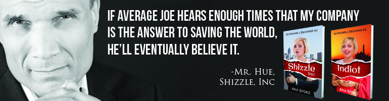
Well, now that I’ve decided not to use the pro to design my book cover, its time to put my Photoshop skills to where my mouth is…You may recall my frustration at the designer’s attempts to create a cover for Shizzle, Inc. Some of you have actually really liked his first concept. Choosing one is so hard!
I finally got a chance to spend a few solid hours on the concept development today and would love your input on my top two so far. These are just concepts, so please ignore the sloppiness of execution, resolution, and watermarks (I just need to sign up and pay for the images). Once I get my head around which way to go, I will further develop that one. Or start from scratch…
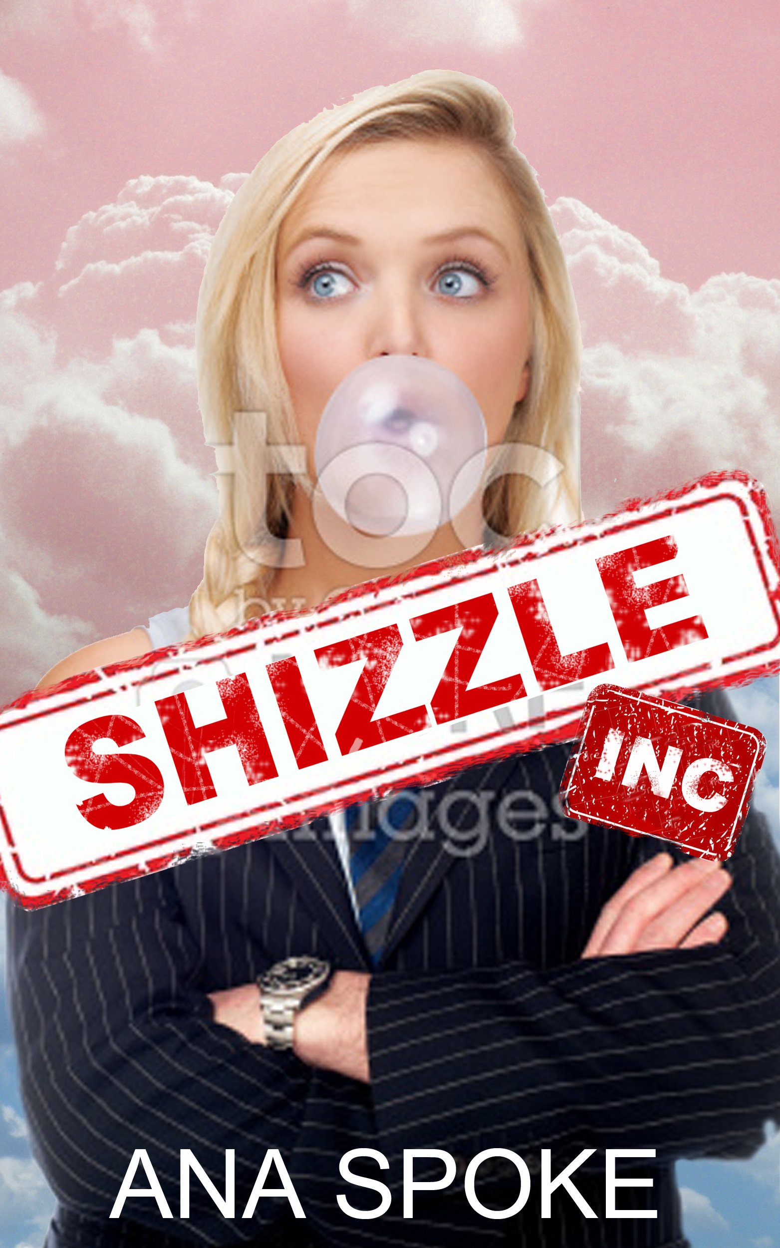
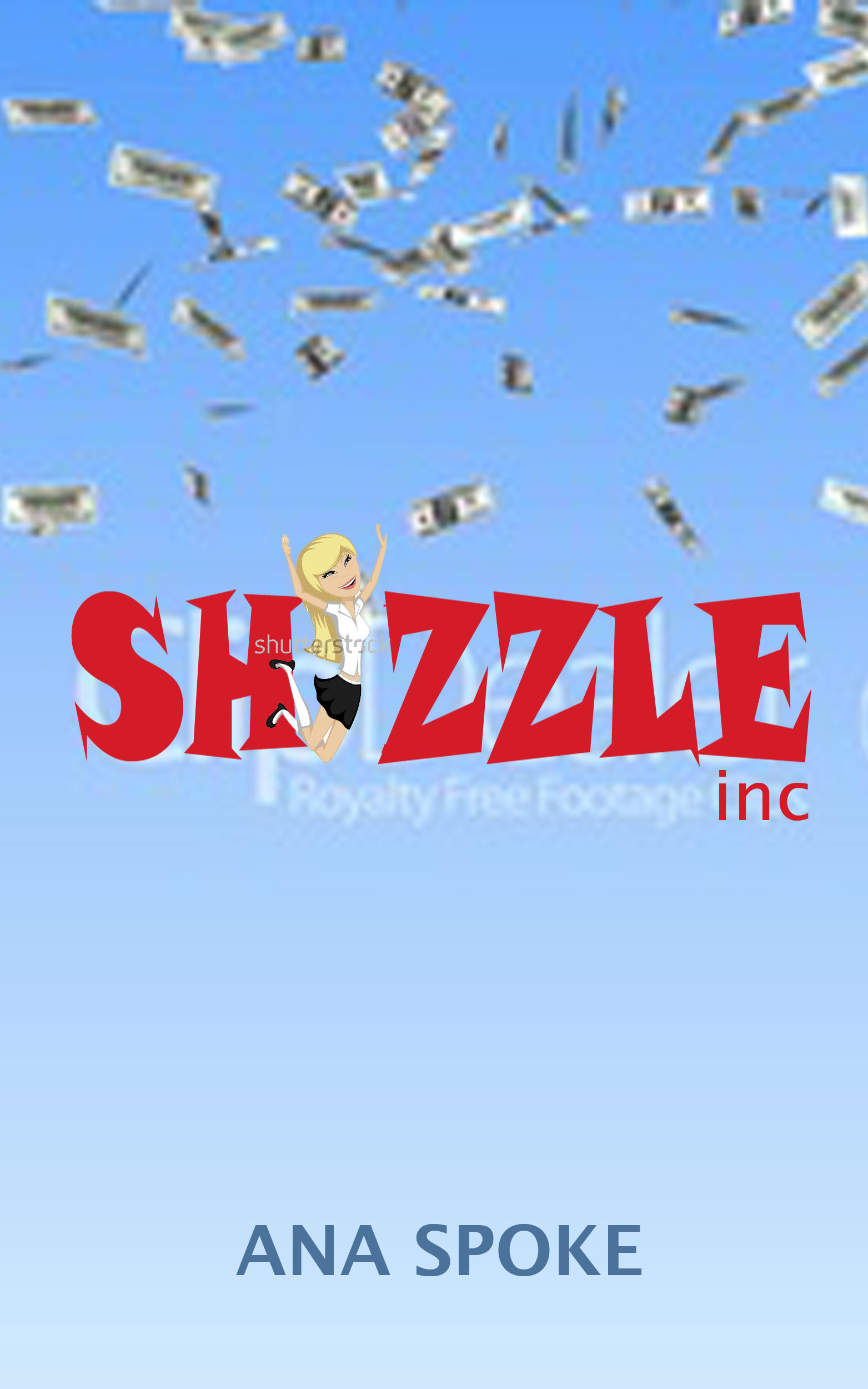
I know, they couldn’t be more different…so which one do you like? The apple or the orange?


The left one! Guess the apple.
LikeLike
I guess it is 🙂 Anything in particular that you liked about this one or disliked about the other? Thank you so much for helping me out.
LikeLike
The right one isn’t clear, it doesn’t have the “straight up in my face, grab me, read my back cover, what’s this, it looks fun”. It also lacks power, the left one jumped in my face. If I was walking through a bookstore it would jump out and (silently) scream “read at least my back cover before you look at anything else”. That back cover is your next step! Good luck, you got something good here
LikeLike
I like the one with the girl popping bubbles on it. Seems more relatable.
LikeLike
Thank you Ben 🙂 Yes, people like faces, and the tiny cartoon girl is actually hard to see on the second one…
LikeLike
All I know is it looks really funny and I’m down with that.
LikeLike
That’s awesome, thank you Ben 🙂 That’s all I ever wanted – to create funny anything…
LikeLike
The left one is far to busy with too many colors and too many images competing for a person’s focus. It doesn’t convey any particular message. If you want to convey two different messages ( which can be confusing) lower the Shizzle and show more of the top clothing, take away the white words They are very distracting and you can’t really tell in glance what they mean) under Shizzle. The bubble gum doesn’t go with the age of the face. Maybe try a side ponytail to give her a young look. You really want the reader to remember the title and your name. Your novel is inside the cover. This is where your story lies. This is what the reader will remember. An excellent fun read. The cover on the right side is much better. The one thing I don’t like is your still printing Shizzle over some white words which I can’t really read nor would I take the time to read if I saw the cover. It does relay to me more than the other cover that the character is young and fun loving and maybe a business woman who makes enough of her money or someone else’s to throw away. I definitely take from the right cover that it will be a light hearted fun read. I would pick this one up and read the inside jacket. On both of your covers do something fun with your name such as print one name in one color and the next in something different. Make your name stand out in a cute way since this is a comedy or find a signature font for the first letter in different colors so the signature is the same but different color for each novel. The color would be dependent on the content of the novel. Or always change the font and color of the first letter of your name for each novel depending on how you feel about the storyline. Make that standout so the reader always looks forward to seeing what you did for that new novel. If they look forward to this the cover will always catch their eye. I hope this helps. Being an avid reader all my life and I have done a little writing I try to be helpful to someone else. None of this is easy but it is rewarding and fulfilling.You have talent and can go far. What you need for your cover is a mullet. Business in the front and a party in the back. Keep us posted!
LikeLike
Thank you Olivia for such a thorough review! Just to clarify, the white lettering is the remnant of a watermark, once I pick the images and buy them, it will not be there. I will take into consideration the busyness of the left one, maybe go back to the original concept, which was simpler. Seems that the “camp” is divided about equally, which is a good news in a way, since it means neither one is “wrong”. Hope to have the next generation done on the weekend 🙂
LikeLike
I just wanted to put my two cents in again. Try taking the bottom from your original mock up with the dark suit and put the new pink clouds mock up on top of that with the torn Shizzle across the middle. Try making the white torn area around Shizzle closer to the letters so that you can see more of the girl. Seeing her shoulder in regular clothing was a nice touch or just add that to the original mock up. The mock up with the little girl is good try adding to it ” an Isla Maxwell Story” under the title. Just some thoughts. Art was my minor. I’ve done some ads for a couple commercials, posters for bands and a few windows for stores. You are talented at creating your own cover. Sorry I missed your comment about the watermarks. Look forward to your “next” generation. Get inspired! You’ll do great!
LikeLike
Thanks again Olivia. I hope to revamp it this weekend.
LikeLike
Orange, foshizzle… for design sensibility: to my mind’s eye (declaring subjectivity) it says ‘the words are good enough, read me’… but two points: (i) as you know, it’s subjective, (ii) the proviso for me is to ask what kind of book is it (and horribly-truthfully what market) – and apolz for not reading back through your posts to find this fact… It’s fiction (age group?). That info may change the ‘impression’ yet I lean to orange at first glance. Adieu.
LikeLike
Thank you! The book is a checklist comedy, if it changes anything. Hence the tiny cartoon chick (she’s hard to see in this mockup). I liked your cover, btw, I guess along the same lines? Is yours a comedy?
LikeLike
I still like orange.
Cheers for commenting on my book cover – it’s not comedy (!) – but it does have humour within the pages – so I guess how subtle/evident that humour is depends on the reader.
Cover was designed by a UK artist I know and it fits the “more abstract/obscure style that suits the contemporary/literary* genre in fiction”
(*interchangeable; can depend on which country you’re based).
OK – best wishes with your book and your ongoing journey … it’s a long road and there’s no turning back.
LikeLike
Thank you, you too!
LikeLike
Definitely the left one. Not so keen on the ‘stamp’ , the word in a different font would look awesome on its own across the front.
I am confused about the one on the right, I am not sure what the oblong things are or what they are meant to represent. I would certainly choose the left cover if I saw it in the book shop. I probably wouldn’t even pick the other one up.
Hope that helps 🙂
LikeLike
Thank you, it does help. I’m going to work a bit more on the left one tomorrow, simplify and try new photos with the same concept in mind. The oblong things on the other one are poor-resolution dollar bills 🙂 People have divided in their feedback, and it was so hard to choose, but the research shows that readers respond better to faces, so I will go with the face… Thanks again for taking your time to comment.
LikeLike
Ha, yet another reason I’m different–I’ll pick up the book without a face every time. More of an adventure that way. I know you’re going with the left, but I’d suggest the right, making the dollar bills denser at the very top, thinning to nothing, lowering the title, and a plain old serif font.
LikeLike
Thank you for your comments, April! I was about to say that it seems most women prefer left, and then I realised you’re a radish 🙂
LikeLiked by 1 person
🙂
LikeLike
Pingback: Another (designer) bites the dust… | AnaSpoke.com
Pingback: Please help me redesign the covers for Isa Maxwell series – including the third book! | Ana Spoke, author